
DUI's Invisible Bill
FIGMA
ADOBE ILLUSTRATOR
Background
For my first task in Information Design Studio Principles at Northeastern University, I had to redesign an existing piece of info design. I chose a design that advocated against driving under the influence (DUI). Over three weeks, I refined both the concept and the way it presented the data.
DESIGN APPROACH
I focused on making the impact of DUI feel more personal. Instead of a macro-scale financial view, I highlighted the household-level burden to encourage responsible decisions.
AUDIENCE
General Households
Road Safety Advocates
Policymakers
Role
Solo Designer
Guided by
Sheila Pontis
Date
Sep 2024
Category
Information Design
DUI's Invisible Bill
DUI's Invisible Bill
DUI's Invisible Bill
DUI's Invisible Bill
Original Design
Understanding the Problem

Final Design
Understanding the Problem

re-design process
understanding the design
This infographic explores how income levels influence lifestyle choices, leading to a message about the dangers of driving under the influence (DUI). It visualizes data on car ownership, commuting, homeownership, marriage, and drinking habits across three income groups, as well as using icons and flow diagrams to it highlight key differences.
Key Issues
Weak Logical Connection Between Data & DUI
The infographic spends most of its space comparing income-based lifestyle differences, but never clearly ties these statistics to DUI risk or consequences.
Key Issues
Weak Logical Connection Between Data & DUI
The infographic spends most of its space comparing income-based lifestyle differences, but never clearly ties these statistics to DUI risk or consequences.
Key Issues
Weak Logical Connection Between Data & DUI
The infographic spends most of its space comparing income-based lifestyle differences, but never clearly ties these statistics to DUI risk or consequences.
Key Issues
Weak Logical Connection Between Data & DUI
The infographic spends most of its space comparing income-based lifestyle differences, but never clearly ties these statistics to DUI risk or consequences.
Irrelevant or Distracting Data
Some categories, like car ownership and drinking habits, have indirect links to DUI. However, many other statistics, such as marriage rates, pet ownership, bird and gerbil ownership, and homeownership, are unrelated.
Irrelevant or Distracting Data
Some categories, like car ownership and drinking habits, have indirect links to DUI. However, many other statistics, such as marriage rates, pet ownership, bird and gerbil ownership, and homeownership, are unrelated.
Irrelevant or Distracting Data
Some categories, like car ownership and drinking habits, have indirect links to DUI. However, many other statistics, such as marriage rates, pet ownership, bird and gerbil ownership, and homeownership, are unrelated.
Irrelevant or Distracting Data
Some categories, like car ownership and drinking habits, have indirect links to DUI. However, many other statistics, such as marriage rates, pet ownership, bird and gerbil ownership, and homeownership, are unrelated.
Poor Data Visualization Methods
The car illustrations (like the half-colored Toyota) are misleading and difficult to interpret. Besides, the arrows crisscross chaotically, which may make readers struggle to follow the intended reading order.
Poor Data Visualization Methods
The car illustrations (like the half-colored Toyota) are misleading and difficult to interpret. Besides, the arrows crisscross chaotically, which may make readers struggle to follow the intended reading order.
Poor Data Visualization Methods
The car illustrations (like the half-colored Toyota) are misleading and difficult to interpret. Besides, the arrows crisscross chaotically, which may make readers struggle to follow the intended reading order.
Poor Data Visualization Methods
The car illustrations (like the half-colored Toyota) are misleading and difficult to interpret. Besides, the arrows crisscross chaotically, which may make readers struggle to follow the intended reading order.
Lack of Strong Visual Hierarchy
The largest and most dominant visuals focus on car brands and ownership, which misleads viewers into thinking the infographic is about car preferences, not DUI risk. Plus, grouping related data into clear, structured segments would improve readability, rather than scattering related points across different sections.
Strategy
In my redesign, I aim to preserve the original intent—using daily lifestyle and expenses to establish a connection to DUI, ultimately advocating against drunk driving. I developed three design strategies to achieve this:
Strategy
In my redesign, I aim to preserve the original intent—using daily lifestyle and expenses to establish a connection to DUI, ultimately advocating against drunk driving. I developed three design strategies to achieve this:
Strategy
In my redesign, I aim to preserve the original intent—using daily lifestyle and expenses to establish a connection to DUI, ultimately advocating against drunk driving. I developed three design strategies to achieve this:
Strategy
In my redesign, I aim to preserve the original intent—using daily lifestyle and expenses to establish a connection to DUI, ultimately advocating against drunk driving. I developed three design strategies to achieve this:
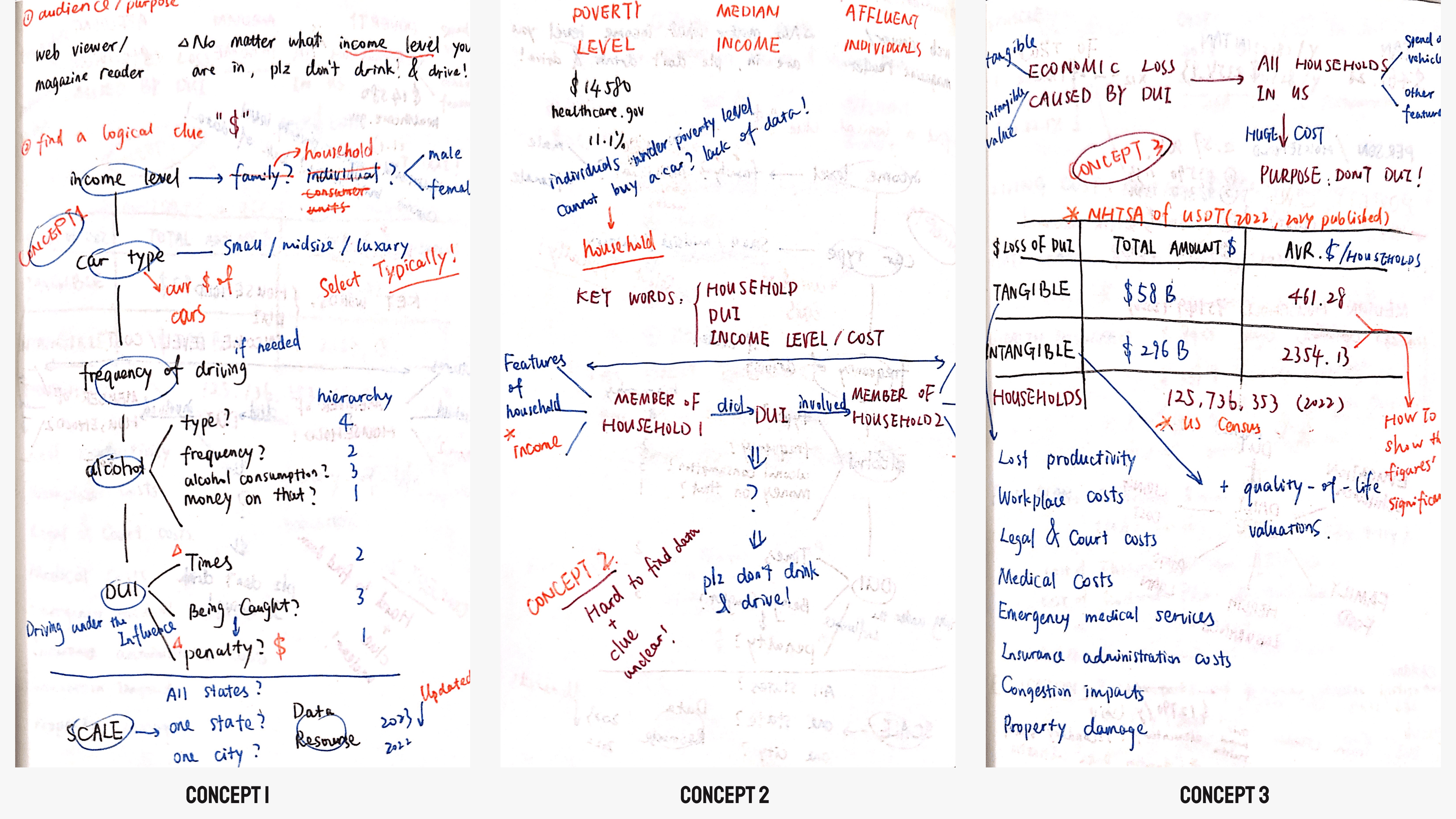
Strategy 1
Income & DUI Probability
This approach explores how different income levels influence car type, driving frequency, drinking habits, and DUI occurrence. If the data shows that DUI rates are similar across all income levels, it reinforces the idea that DUI is not limited to any specific group—everyone is responsible for preventing it.
Strategy 2
DUI’s Impact on Both Families
This strategy shifts the focus to families affected by DUI—both those causing and suffering from DUI-related incidents. By comparing key household indicators (such as income levels), the design highlights that DUI affects all types of families, making it a universal issue that concerns everyone.
Strategy 3
DUI Costs vs. Household Expenses
This approach does not focus on income levels. Instead, it compares the financial burden of DUI-related losses to common household expenses. It shows that DUI costs create a heavy financial strain on the average American family.
Strategy 3
DUI Costs vs. Household Expenses
This approach does not focus on income levels. Instead, it compares the financial burden of DUI-related losses to common household expenses. It shows that DUI costs create a heavy financial strain on the average American family.
Strategy 3
DUI Costs vs. Household Expenses
This approach does not focus on income levels. Instead, it compares the financial burden of DUI-related losses to common household expenses. It shows that DUI costs create a heavy financial strain on the average American family.
Strategy 3
DUI Costs vs. Household Expenses
This approach does not focus on income levels. Instead, it compares the financial burden of DUI-related losses to common household expenses. It shows that DUI costs create a heavy financial strain on the average American family.
After reviewing all three strategies, I chose Strategy 3. It offers a clear, logical, and data-driven way to relate DUI to everyday life. The first strategy tried to connect income levels to DUI probability. However, this link is weak and hard to prove with data. The second strategy showed that DUI impacts all types of families. But finding solid comparative data to support this was difficult.
The third strategy allows for easily accessible statistics, such as DUI-related financial losses and common household expenses. This makes the comparison both relatable and fact-based, creating a stronger visual argument. Instead of targeting specific demographics, it presents DUI as a financial issue that affects every household. It highlights how DUI-related losses put financial strain on families, no matter their income level. This approach strengthens the urgency of DUI prevention in a way that connects with all audiences.
data gathering
To ensure accuracy and credibility, I used reliable, publicly available data from government agencies, research institutions, and financial reports. The data in the infographic mainly falls into two categories:
data gathering
To ensure accuracy and credibility, I used reliable, publicly available data from government agencies, research institutions, and financial reports. The data in the infographic mainly falls into two categories:
data gathering
To ensure accuracy and credibility, I used reliable, publicly available data from government agencies, research institutions, and financial reports. The data in the infographic mainly falls into two categories:
data gathering
To ensure accuracy and credibility, I used reliable, publicly available data from government agencies, research institutions, and financial reports. The data in the infographic mainly falls into two categories:
DUI-Related Economic Impact
Data from NHTSA (National Highway Traffic Safety Administration) and HHS (U.S. Department of Health & Human Services) provided insights into the total financial losses caused by DUI, including lost productivity, medical costs, legal expenses, and property damage.
DUI-Related Economic Impact
Data from NHTSA (National Highway Traffic Safety Administration) and HHS (U.S. Department of Health & Human Services) provided insights into the total financial losses caused by DUI, including lost productivity, medical costs, legal expenses, and property damage.
DUI-Related Economic Impact
Data from NHTSA (National Highway Traffic Safety Administration) and HHS (U.S. Department of Health & Human Services) provided insights into the total financial losses caused by DUI, including lost productivity, medical costs, legal expenses, and property damage.
DUI-Related Economic Impact
Data from NHTSA (National Highway Traffic Safety Administration) and HHS (U.S. Department of Health & Human Services) provided insights into the total financial losses caused by DUI, including lost productivity, medical costs, legal expenses, and property damage.
Household Expenses & Financial Comparisons
To make the DUI costs more tangible, I gathered up-to-date household spending data from sources such as:
U.S. Census Bureau (household income distribution)
USDA (U.S. Department of Agriculture) (monthly food costs)
NCES (National Center for Education Statistics) (education expenses)
KFF (Kaiser Family Foundation) (health insurance costs)
Experian & Rent Market Reports (average rent and loan costs)
storytelling
step 1
Establishing the Scale of DUI Losses
The story starts with the massive $296 billion in DUI-related economic losses, which are broken down into lost productivity, medical costs, and legal expenses. Then, to make the impact clearer, I calculate the per-household cost. By dividing the total loss among 125.7 million U.S. households, I show that each household effectively carries a $2,354 burden due to DUI.
step 2
Making It Personal: What Could $2,354 Cover?
To contextualize this financial loss, I compare $2,354 to essential household expenses, illustrating how these unnecessary losses—if DUI incidents were prevented—could instead be used for more meaningful purposes, such as:
Rent or mortgage payments
Auto Loan
Healthcare or insurance coverage
Food expenses
Education costs
By showing this contrast, I want to say that DUI-related financial burdens are more than just numbers. They represent wasted resources that could have improved families' lives. Preventing DUI ensures that this money goes to essential needs instead of being lost to avoidable consequences.
step 3
Lost Opportunities and Lost Lives
By comparing DUI-related losses to education expenses, the narrative leads to a deeper impact. Some children may miss out on better education because of the financial strain DUI puts on their families. Others face an even greater loss: their lives. In this case, it is not just about wasted money; it is about wasted potential and preventable tragedies.
step 4
A Call to Action
After presenting the main idea—that DUI affects not just individuals but every household, creating financial strain and leading to preventable tragedies—I want to leave a final message: For your family, your household, and the future of our children, do not drive under the influence.

iteration
First Edition
For the final delivery, I used red and yellow—colors commonly associated with warnings—along with dark blue to emphasize the seriousness of the topic. To highlight the societal impact, I placed a map of the United States beneath the figures to reinforce the data’s relevance to the U.S.
To add credibility, I included a list of the nine evaluated aspects of this impact. I then presented a section detailing the calculations, clearly labeling each part of the equation and emphasizing the final equalized loss. For better comparison, I used a visual histogram to contrast the data effectively.
In the concluding section on the presentation’s objectives, I used a bright yellow background and prominently displayed a traffic sign prohibiting drunk driving. This reinforced the core message and purpose of the presentation.

Final Design
I received valuable feedback on my studio work. Professor Pontis recommended applying the "less is more" principle when using color. Gab questioned the arrangement of elements in the icons, and Chaitanya suggested optimizing border spacing and scaling key data for better readability.
At first, I overlooked the difference between screen and print colors, making it necessary to adjust the designs for print. My original use of red and yellow as primary colors presented challenges, particularly with yellow’s high visual impact and difficulty in distinguishing its shades. To address this, I revised the color scheme for a more structured approach:
Red for losses and key figures.
Yellow for households and expenditures.
Dark blue for demographic and social data.
I also implemented other key adjustments:
Total Losses Section
Enhanced the yellow background of the U.S. map to emphasize the national focus.
Adjusted the loss components’ color to dark blue, matching the text color for better contrast.
Used a triangular arrow to clearly connect related areas and improve visual flow.
Total Losses Section
Enhanced the yellow background of the U.S. map to emphasize the national focus.
Adjusted the loss components’ color to dark blue, matching the text color for better contrast.
Used a triangular arrow to clearly connect related areas and improve visual flow.
Total Losses Section
Enhanced the yellow background of the U.S. map to emphasize the national focus.
Adjusted the loss components’ color to dark blue, matching the text color for better contrast.
Used a triangular arrow to clearly connect related areas and improve visual flow.
Total Losses Section
Enhanced the yellow background of the U.S. map to emphasize the national focus.
Adjusted the loss components’ color to dark blue, matching the text color for better contrast.
Used a triangular arrow to clearly connect related areas and improve visual flow.
Formula for Average Loss
Intensified red in the numerator to highlight losses.
Changed yellow in the denominator to dark blue for better readability.
Adjusted the scale of the result to make the equation clearer.
Formula for Average Loss
Intensified red in the numerator to highlight losses.
Changed yellow in the denominator to dark blue for better readability.
Adjusted the scale of the result to make the equation clearer.
Formula for Average Loss
Intensified red in the numerator to highlight losses.
Changed yellow in the denominator to dark blue for better readability.
Adjusted the scale of the result to make the equation clearer.
Formula for Average Loss
Intensified red in the numerator to highlight losses.
Changed yellow in the denominator to dark blue for better readability.
Adjusted the scale of the result to make the equation clearer.
Family Data Comparisons
Removed the yellow background for regionality and placed it in the About Children section, as it is a continuation of the Education Data Comparisons.
Increased yellow contrast in the chart while softening red to reduce visual strain.
Reorganized charts for poor families, ensuring the average loss value appears first to align with the median family chart and maintain logical flow.
Median Household Data
Reformatted the content layout, placing the example statistic in the bottom right corner to maintain typographic balance and emphasize its secondary role.
Simplified chart labels to avoid lengthy, confusing text.
Removed the gradient text bar and integrated key insights within the chart’s body.
Presented critical information with minimal distraction, using a framed section with bolded key figures in darker yellow to subtly emphasize household data.
Optimized spacing and white space for a cleaner look.
Children’s Section & Final Layout
Added a background color transition for a smoother shift to the final initiative.
Vertically aligned text paragraphs for easier reading.
Repositioned the pie chart next to its relevant paragraph to improve information flow.
Made minor changes to the source section to accommodate the updated layout.
Takeaways
Less is more: simplify for clarity
The initial version was visually dense and hard to navigate. By improving spacing, hierarchy, and color usage, I made the final design more readable and structured, ensuring key takeaways stood out.
Takeaways
Less is more: simplify for clarity
The initial version was visually dense and hard to navigate. By improving spacing, hierarchy, and color usage, I made the final design more readable and structured, ensuring key takeaways stood out.
Takeaways
Less is more: simplify for clarity
The initial version was visually dense and hard to navigate. By improving spacing, hierarchy, and color usage, I made the final design more readable and structured, ensuring key takeaways stood out.
Takeaways
Less is more: simplify for clarity
The initial version was visually dense and hard to navigate. By improving spacing, hierarchy, and color usage, I made the final design more readable and structured, ensuring key takeaways stood out.
Data storytelling strengthens engagement
Instead of presenting DUI costs as just a national statistic, I reframed them as a household financial burden, making the issue more personal and relatable for the audience.
Data storytelling strengthens engagement
Instead of presenting DUI costs as just a national statistic, I reframed them as a household financial burden, making the issue more personal and relatable for the audience.
Data storytelling strengthens engagement
Instead of presenting DUI costs as just a national statistic, I reframed them as a household financial burden, making the issue more personal and relatable for the audience.
Data storytelling strengthens engagement
Instead of presenting DUI costs as just a national statistic, I reframed them as a household financial burden, making the issue more personal and relatable for the audience.
Color choices matter
The original red-yellow combination caused visual strain and made some text difficult to read. I revised the palette to create a clearer, more structured visual flow.
Color choices matter
The original red-yellow combination caused visual strain and made some text difficult to read. I revised the palette to create a clearer, more structured visual flow.
Color choices matter
The original red-yellow combination caused visual strain and made some text difficult to read. I revised the palette to create a clearer, more structured visual flow.
Color choices matter
The original red-yellow combination caused visual strain and made some text difficult to read. I revised the palette to create a clearer, more structured visual flow.
Highlight what truly matters
In the first version, $2,354 in losses per household and 283 child fatalities didn’t stand out enough. I scaled and repositioned these elements to ensure they immediately grab attention and reinforce the message.
Highlight what truly matters
In the first version, $2,354 in losses per household and 283 child fatalities didn’t stand out enough. I scaled and repositioned these elements to ensure they immediately grab attention and reinforce the message.
Highlight what truly matters
In the first version, $2,354 in losses per household and 283 child fatalities didn’t stand out enough. I scaled and repositioned these elements to ensure they immediately grab attention and reinforce the message.
Highlight what truly matters
In the first version, $2,354 in losses per household and 283 child fatalities didn’t stand out enough. I scaled and repositioned these elements to ensure they immediately grab attention and reinforce the message.