
Not Always More for More
FIGMA
ADOBE ILLUSTRATOR
Context
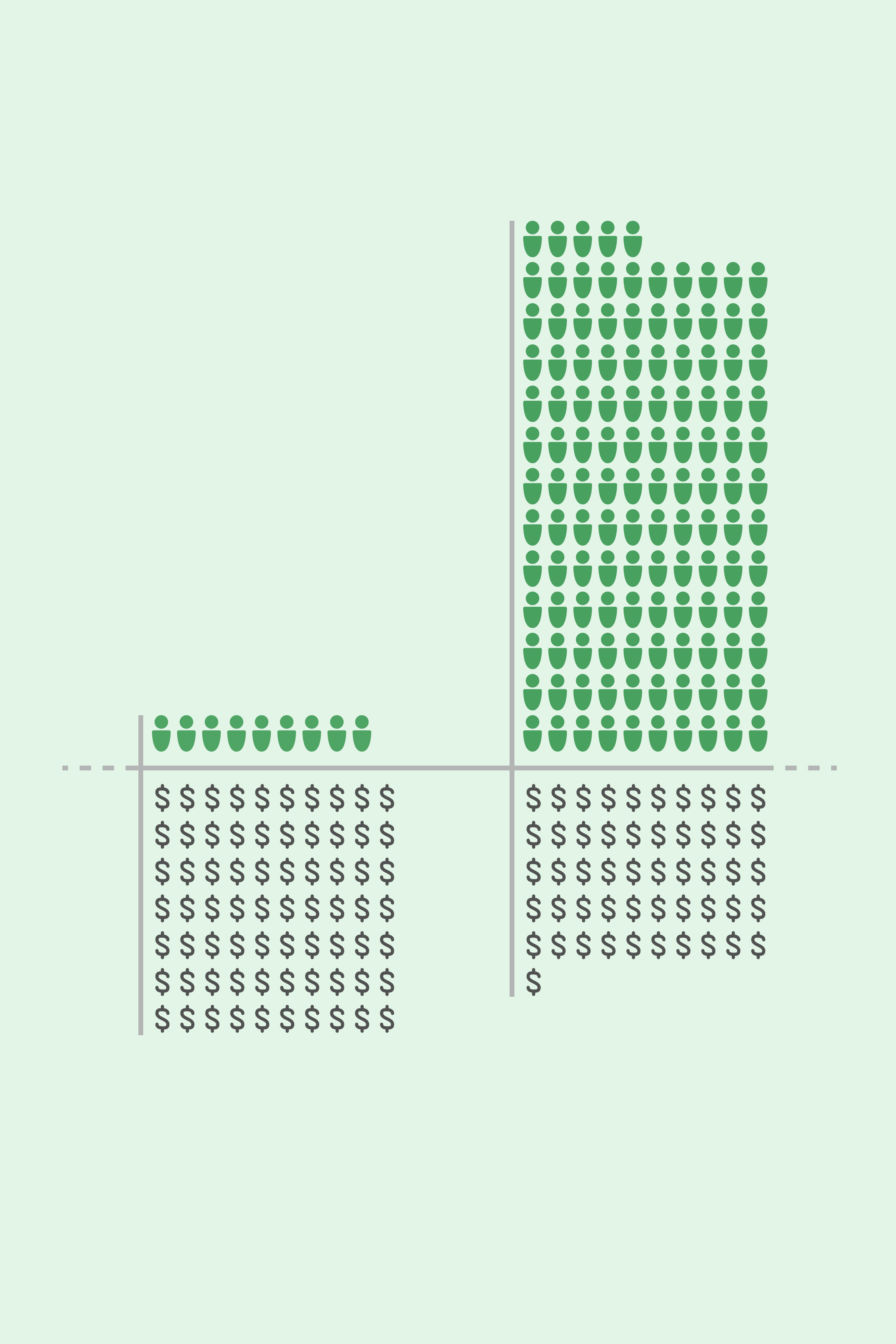
Does higher health spending mean longer life? This project compares per capita healthcare costs and life expectancy across countries in 2022, revealing surprising imbalances.
Solution
Translated three key indicators: life expectancy, total population, and health spending per capita, into intuitive visual units.
Used ISOTYPE-style icons to represent real-world scale that are easy to read and interpret.
Focused on visual contrast, highlighting the diverse relationships between healthcare spending and health outcomes across countries.
Impact
This project aims to make global healthcare data more understandable and relatable, helping viewers see how spending and outcomes vary across countries.
Role
Information Designer
Guided by
Todd Linkner
Date
Mar - Apr 2025
Category
Data Visualization
Not Always More for More
FIGMA
ADOBE ILLUSTRATOR
Context
Does higher health spending mean longer life? This project compares per capita healthcare costs and life expectancy across countries in 2022, revealing surprising imbalances.
Solution
Translated three key indicators: life expectancy, total population, and health spending per capita, into intuitive visual units.
Used ISOTYPE-style icons to represent real-world scale that are easy to read and interpret.
Focused on visual contrast, highlighting the diverse relationships between healthcare spending and health outcomes across countries.
Impact
This project aims to make global healthcare data more understandable and relatable, helping viewers see how spending and outcomes vary across countries.
Role
Information Designer
Guided by
Todd Linkner
Date
Mar - Apr 2025
Category
Data Visualization
Not Always More for More
Not Always More for More
Not Always More for More
Not Always More for More
