
What was the goal?
Create an emotionally resonant, interactive experience that draws attention to the ongoing tragedy of migrant deaths, which often go unnoticed despite happening nearby. By focusing on the lives lost near Lampedusa, the project makes the crisis visible, engages the public through quiet reflection, and provides tools to understand the issue and advocate for change.
Who is the audience & what do they need?
Audience: General public
Needs:
A way to connect with the scale and proximity of the crisis on an emotional level, to understand that these losses are not distant, and to be given space to reflect, feel, and begin to care.
What was the design challenge?
1
Find a narrative anchor the public could relate to and emotionally immerse in.
2
Create an experience that feels more like a digital requiem that invites reflection, rather than a dashboard filled with dots and static charts.
Where did I come in?
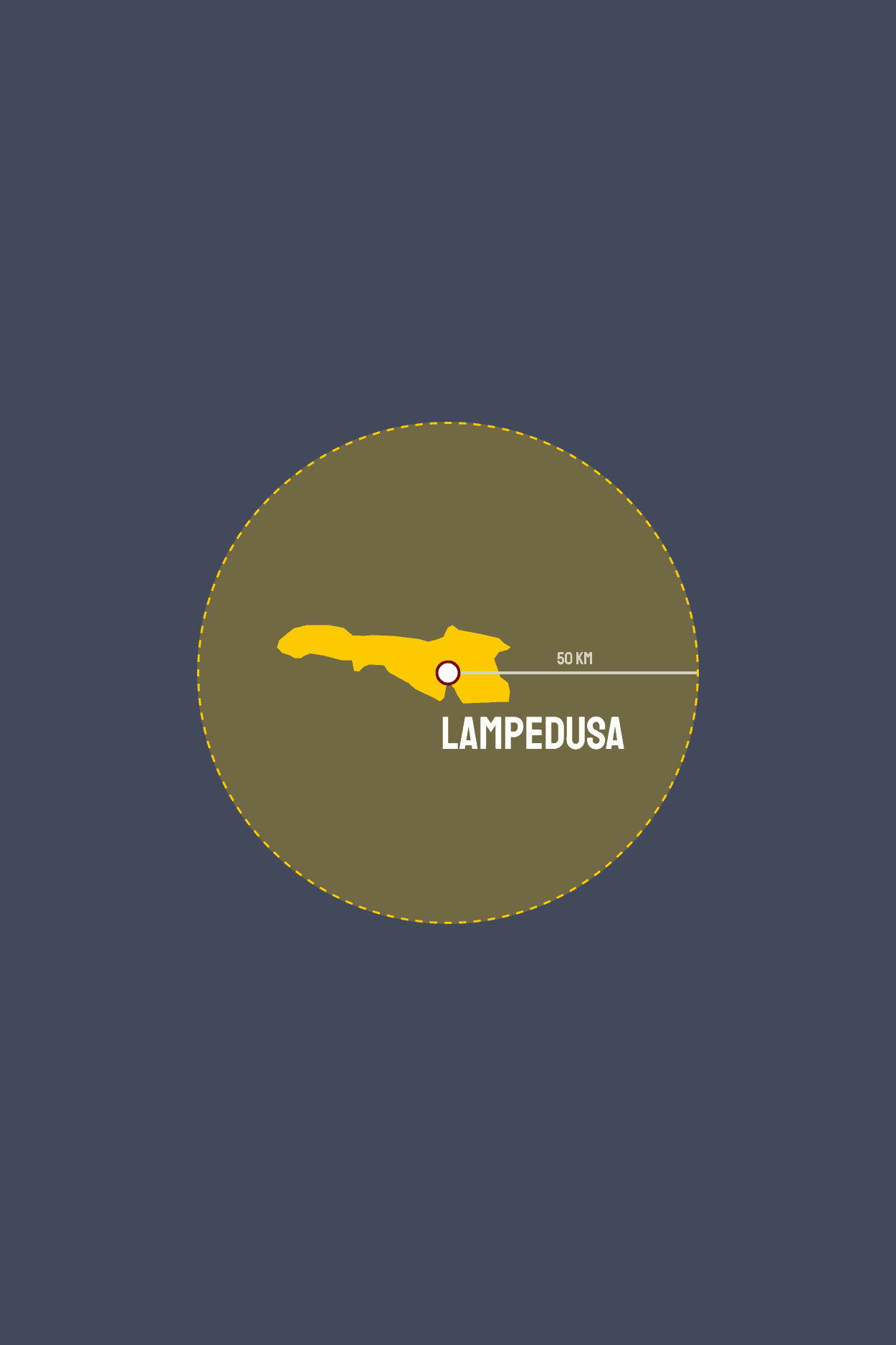
I started by working with a global dataset from the International Organization for Migration, which documents migrant deaths and disappearances across the world. To bring clarity and emotional focus to the project, I chose to tell the story of a single place—Lampedusa. Using Python, I filtered about 100 records to isolate those that occurred within 50 kilometers of the island. This data processing phase laid the groundwork for a more intimate narrative experience.
How did I organize the content?
The project unfolds in four narrative parts, each building emotional and analytical depth through motion, structure, and story.
1
Intro
The experience begins in silence. A deep blue background evokes the vastness of the sea, quiet and still. As the viewer scrolls, soft ripples gradually appear, each one marking absence and loss. Short lines of text reveal fragments of real tragedies, while the animation’s growing rhythm sets an emotional pace that draws the viewer in.
2
Outlines
This section forms the heart of the piece. Each migrant death is visualized through animated paths and ripples. Real-time statistics accumulate beside the animation. The following pages provide context: Why Lampedusa? Why this narrow corridor? What does 50 kilometers mean?
3
Trends
A decade of data is presented in a concise visual analysis. A dual-line chart shows how both incidents and deaths have increased, especially in recent years, revealing a pattern rather than isolated events.
4
Ending
The final scene is quiet and poetic. It shifts the viewer from numbers to human scale, using perspective and language to underscore how even 206 lives lost last year cannot be dismissed. The closing message invites reflection: they were almost there, and yet—they weren’t.
How did I connect design and emotion?
The project unfolds in four narrative parts, each building emotional and analytical depth through motion, structure, and story.
1
Rhythm through ripples
In the opening scene, soft ripples emerge against a deep blue sea and gradually increase in frequency. This pacing sets the emotional tone and introduces the core visual language of the project.
2
Symbol and distance
The silhouette of Lampedusa fades in and transforms into a yellow cross. A 50-kilometer radius extends from this center, visually marking how close the migrants came to land and how close they were to life.
3
Quiet, restrained language
The entire experience is built with simple, thoughtful wording and a minimal color palette of deep navy, soft gradients, and mourning-inspired yellow. The tone remains calm and serious, allowing the weight of the story to emerge on its own.
How does it look at the end?
The final project is a fully interactive scrollytelling website that invites viewers into a quiet, visual journey through data, space, and memory. To experience it as intended, please resize your browser window to at least 1200×600 pixels. For the best visual performance, we recommend viewing on a Mac device. Windows may display slight inconsistencies in path animation timing and font rendering.
What did I learn?
1
Data must be shaped with care
Working with raw fatality records taught me how important it is to clean, verify, and filter data responsibly, especially when lives are involved. The process of narrowing a global dataset into a local, human-scale story was as much ethical as it was technical.
2
A powerful story needs a precise entry point
Choosing Lampedusa and the 50km radius helped ground the story in both geography and emotion. Finding that anchor made a vast crisis feel more personal. It’s never easy to locate a clear focus in a large dataset, but this time I was lucky and glad to have found one that truly resonated.
3
Details define the experience
Building the website taught me to think beyond the design itself and to anticipate edge cases, prevent visual overload, and ensure users move through the piece as intended. Interaction design became just as important as visual design.
4
Let the data carry the message
I learned to step back and let the numbers and visuals speak. With the right pacing and restraint, the dataset itself holds emotional power with no embellishment needed.