Melovision
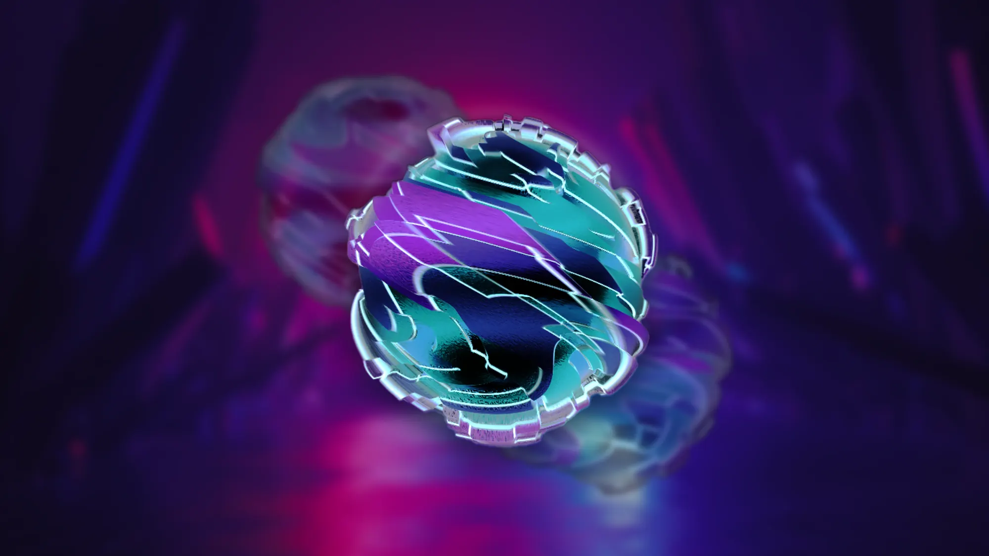
A music discovery concept that renders each song as a generative form driven by its own audio.
- TouchDesigner
- Figma
- Timeline
- Jul 2023 – Oct 2023
- Role
- Designer & Researcher
- Outcome
- Generative visual system and music-discovery prototype
Section
Making recommendations visible
Recommendation systems save time. I started from a question about the cost: do they also narrow what listeners hear, and hide how a recommendation is made?
A survey of 105 listeners rated the recommendation mechanism. Convenience and satisfaction came apart.
6.13/ 10
Convenience
5.30/ 10
Satisfaction with what it recommended
What people wanted was not more recommendations. 66.7% chose a system that noticed when their preferences changed, 55.2% more diverse genres, and 51.4% less time auditioning songs before deciding whether they liked them.
Six interviews showed the same system from three sides. Listeners found the recommendations repetitive, independent musicians struggled to reach listeners who did not already follow them, and algorithm engineers explained how the system reduces individual preferences into reusable patterns.
So I did not set out to build a better recommender. I set out to make both the song and the listener’s preferences easier to read.
Turning a song into a form
I took cymatics as the starting point. Sound vibration already produces visible patterns, so a form generated from a song follows from the music rather than decorating it.
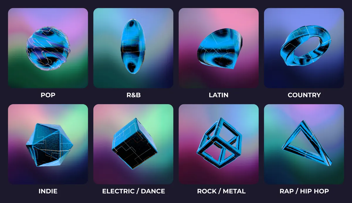
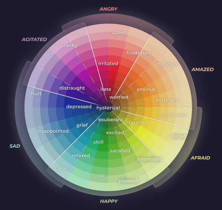
I gave each song three independent layers: shape for genre, colour for emotion, and surface texture from its audio spectrum.
Shape carries genre. Eight geometries, one per genre group. I made it the coarsest of the three layers, so it is the one read first.
Colour carries emotion. An emotion wheel sets it, and this is the one layer I let the listener override by hand.
Texture carries the spectrum. The audio drives it: low frequencies push the surface into depth, middle frequencies run vertically through the form, high frequencies cross it horizontally.
The frequency mapping is the part I would defend hardest. Bass is felt as weight, midrange carries the vocal and melodic body, treble is detail and edge: each band shapes the form the way the ear already treats it. I can give a reason for every assignment and I have tested none of them.
| Reading | Drives |
|---|---|
| Spectral centroid | Mood tone |
| Low frequency | Depth of the surface |
| Middle frequency | Vertical texture |
| High frequency | Horizontal texture |
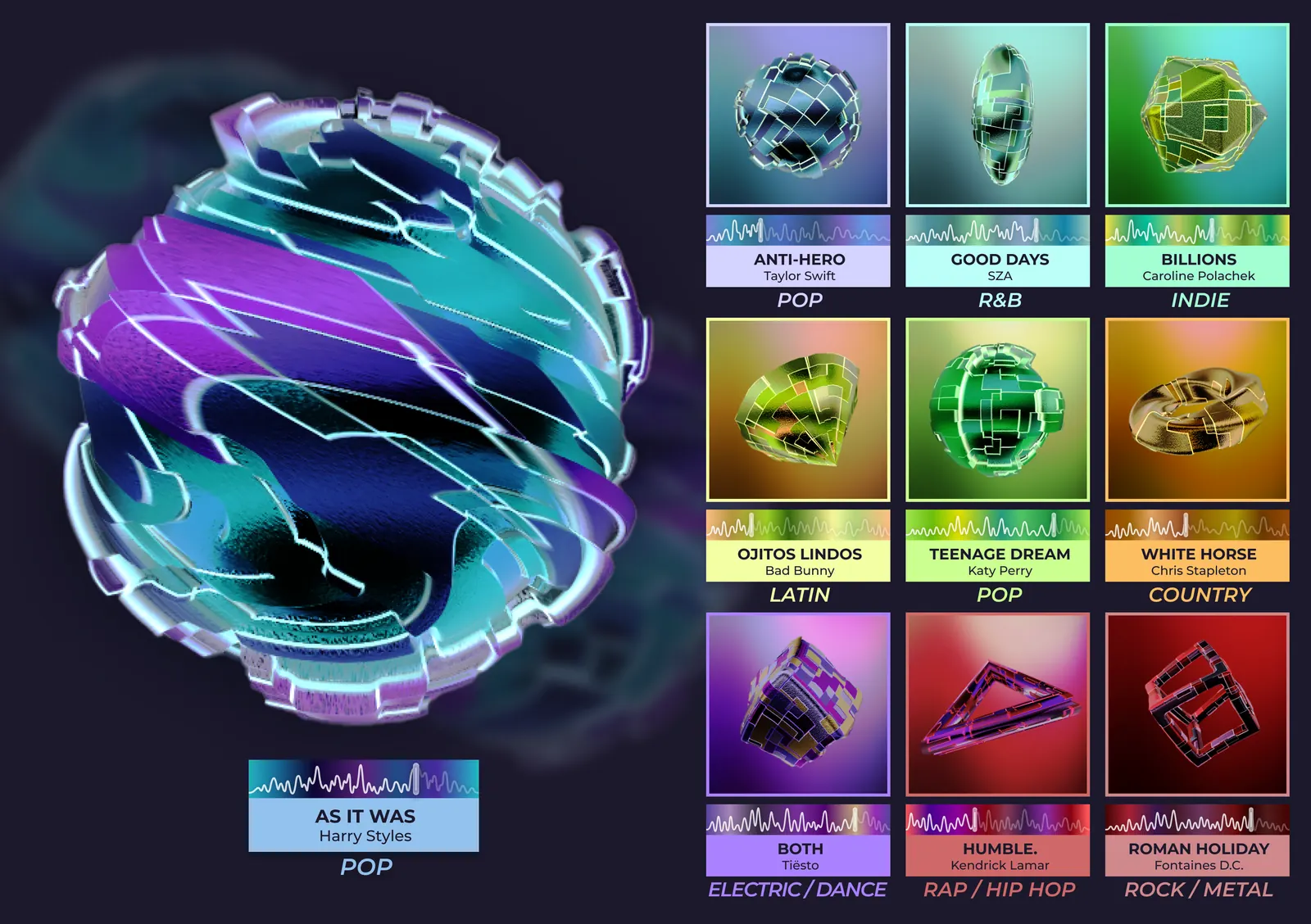
Because the layers are independent, two songs in one genre share a shape and diverge in colour and surface. I ran nine released tracks through the whole pipeline to check the system made forms you could tell apart rather than nine versions of one object.
How the forms are generated
Audio in. The track is read as audio rather than as metadata, so the form comes from the recording.
Spectrum analysis. The signal is split into its frequency bands and a spectral centroid.
Parameter extraction. Each band becomes a number, and the spectral centroid becomes the mood tone.
Geometry and surface. The numbers displace the genre geometry and work its surface; the emotion layer sets the colour.
Rendering. TouchDesigner generates the form in real time, which is what let it run as video at room scale later.
Giving listeners control
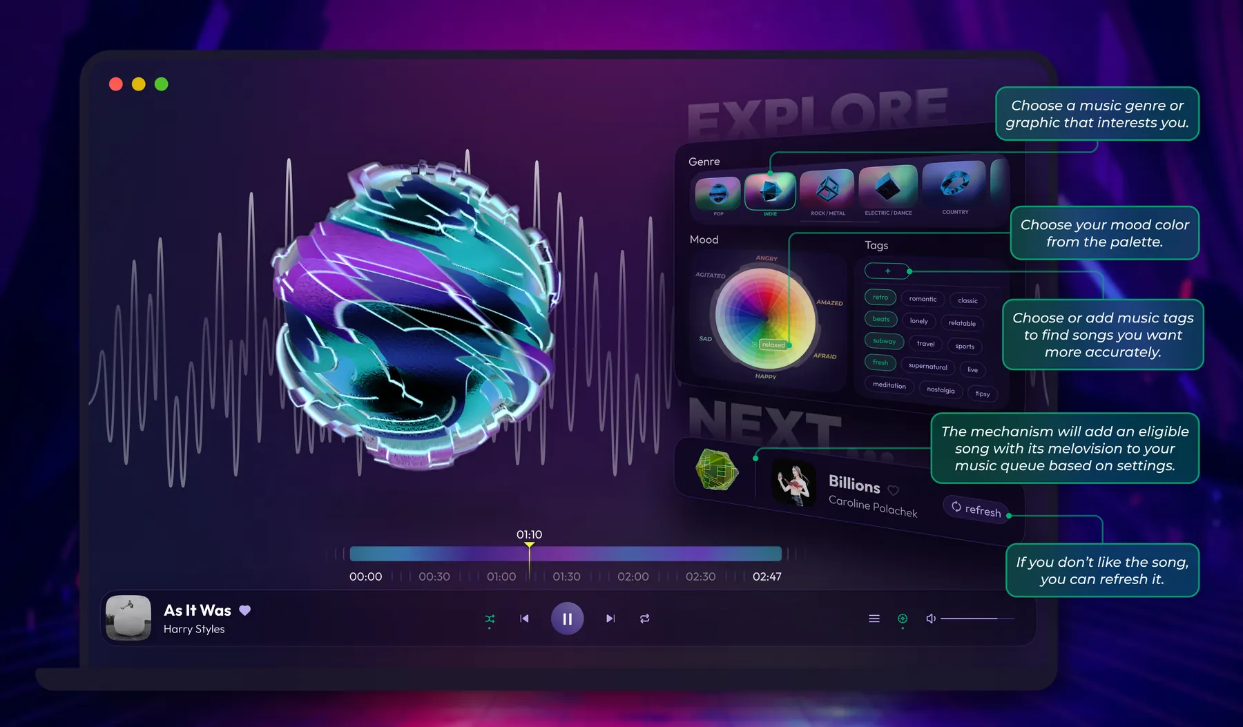
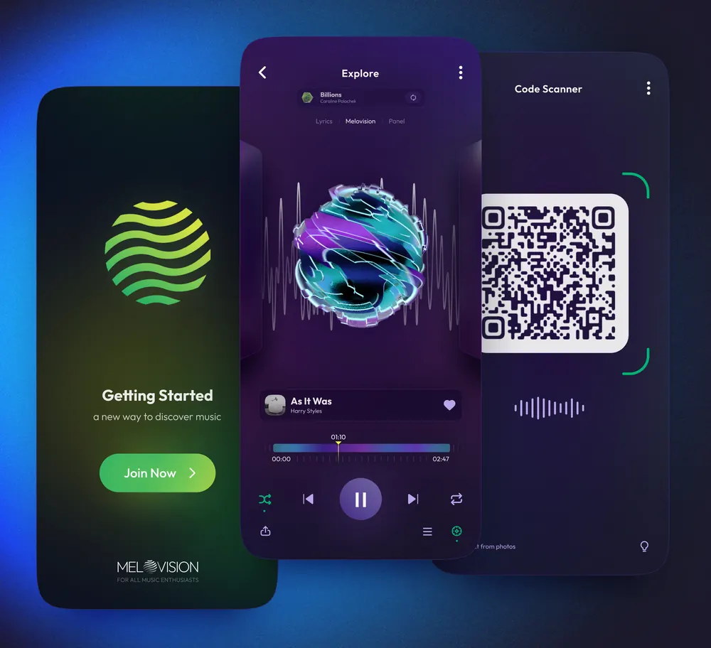
So I turned the preference model into a set of controls. Rather than let the system infer everything silently, I put genre, mood and tags in front of the listener, with a way to reject what comes back and ask for another.
That reverses what the research found. The system still recommends music, but the listener can see what shaped the recommendation and change it.
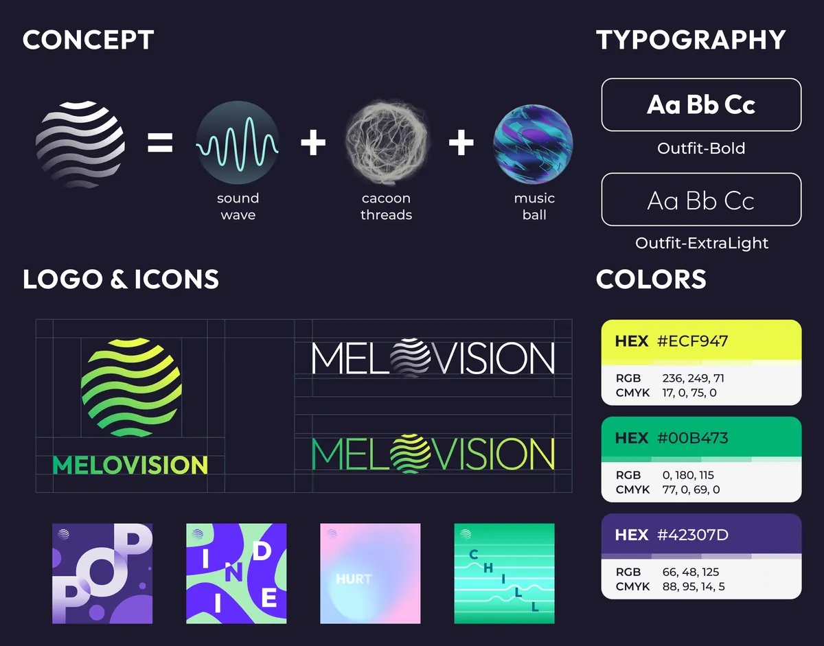
I carried the same visual language into an identity, a promotion site and printed invitations, as one system in other media rather than separate outcomes.
From screen to room
I projected the forms at room scale to see whether they still worked outside the app. The projection was not interactive; it was a spatial test.
The change in scale mattered. On a phone a music form behaved like album art. At several metres wide it became something people could stand in front of, compare and discuss, which is what convinced me the form had a use beyond a private recommendation feed.
What remains untested
The research established the problem, not the solution.
I never tested whether anyone could read genre off a shape, whether the emotion colours matched associations beyond my own, or whether the forms made choosing music faster. Shape is the weakest of the three: eight geometries have no inherent connection to eight genres, so a listener would have to learn them, which is the cost the project set out to remove.
Credits
- Skills
- Interaction design
- User research
- Generative design
- Information visualization
- Visual identity
- Tools
- TouchDesigner
- Figma
- Roles
Design and research
- Zhuoqi Liu
Portfolio guidance
- Vince Ye