Not Always More for More
A unit chart comparing life expectancy, population, and per-capita health spending across ten countries in 2022.
- Figma
- Adobe Illustrator
- Timeline
- Mar 2025 – Apr 2025
- Role
- Information Designer
- Outcome
- Static information graphic
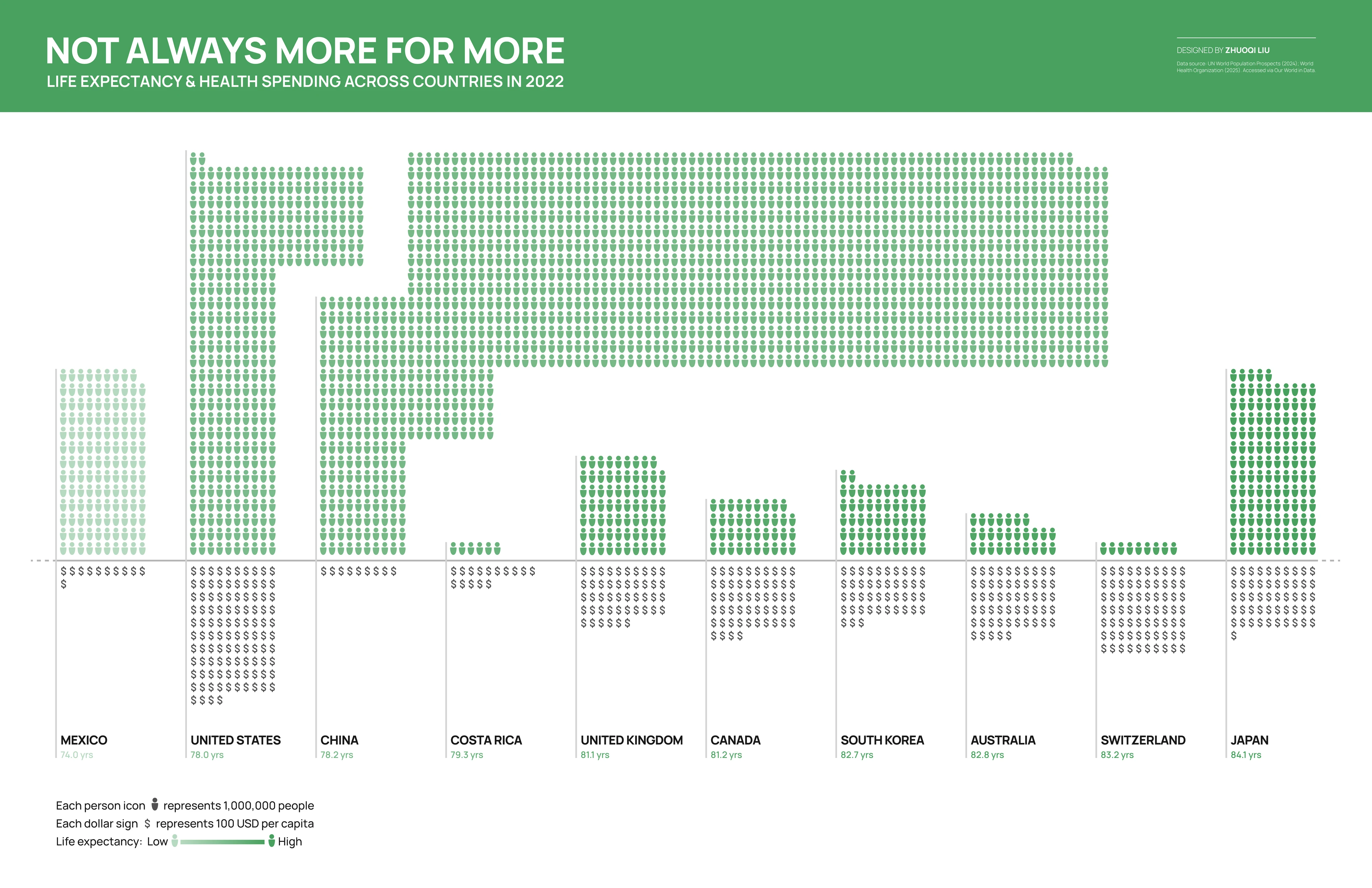
Does higher health spending mean longer life? I explored that relationship with 2022 data. Instead of another scatter plot, I used ISOTYPE-inspired unit symbols so the quantities could be read as tangible counts.
Reading the chart
I chose counting over position. A scatter plot puts both variables on continuous axes and asks the reader to interpret where a dot sits; a unit chart asks them to count. Counting is slower and cannot show a correlation, but it hands the reader a rule they can apply themselves: one icon is a million people, one dollar sign is a hundred dollars a head, and both convert to their own country without anyone explaining the chart.
I sorted by life expectancy rather than by spending, left to right from Mexico at 74.0 years to Japan at 84.1, with colour lightness tracking the same variable. Sorted by spending, the United States lands at one end and the finding collapses into one anomaly a reader can dismiss.
Sorted this way, the top half holds no surprise: populations vary. The bottom half is where it lands. The United States column runs to more than a hundred dollar symbols, an order of magnitude past China at nine and Costa Rica at fifteen, and its life expectancy of 78.0 years sits below both of them.
Iterating the encoding
I built four versions, and changed something different in each.
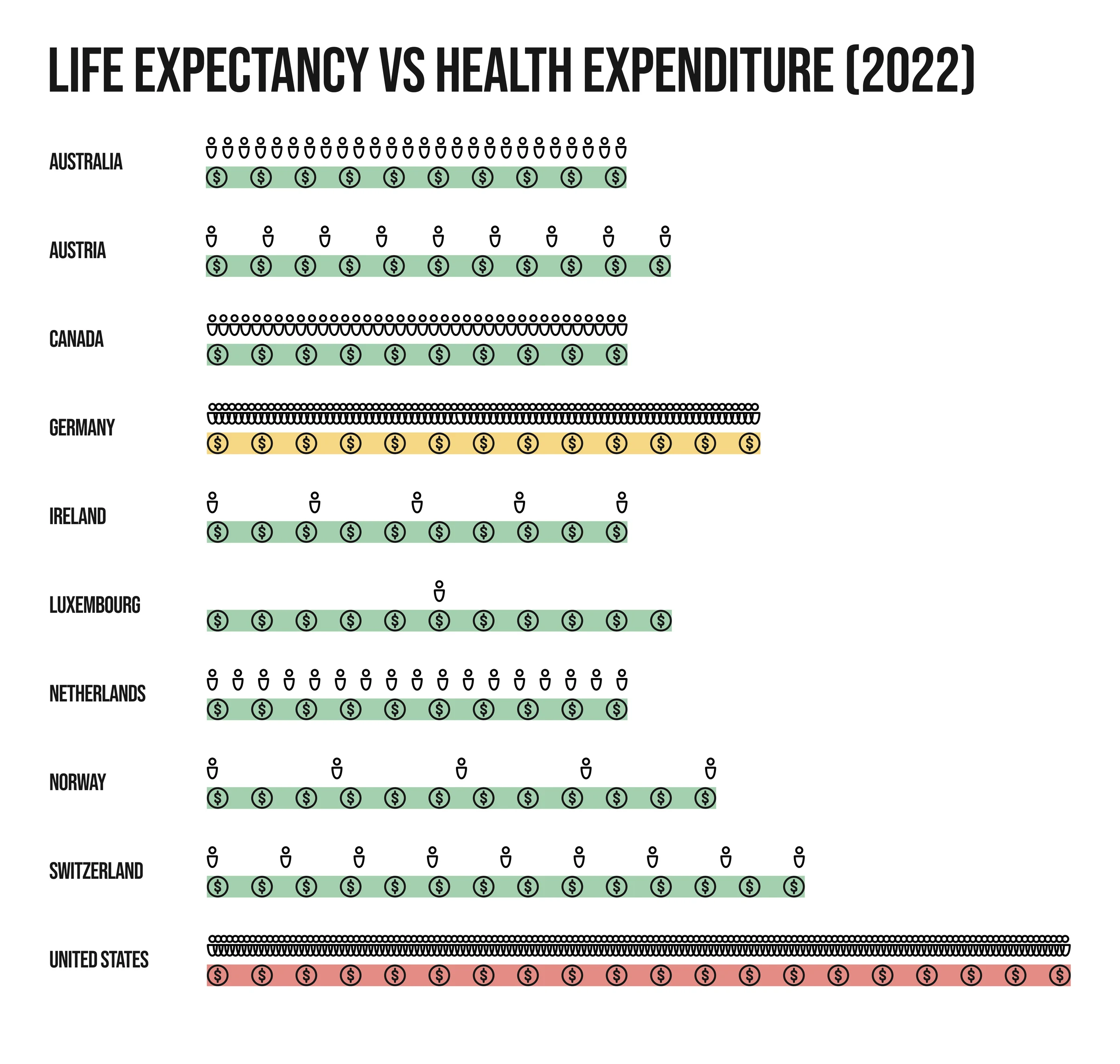
The first version. I gave each country one fixed-width row. Because the width was fixed and the counts were not, the icons had to shrink to fit: Luxembourg got one large figure, the United States several hundred specks. Symbols that are not the same size cannot be counted, so what I had built was a badly drawn bar chart.
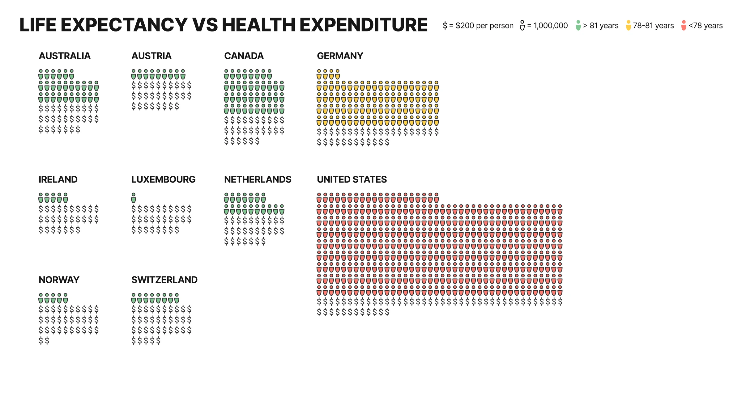
The second version. I moved to a small-multiples grid: one symbol size everywhere, population and spending stacked in one column per country. To keep the American block from swallowing the layout I raised the dollar unit to $200.
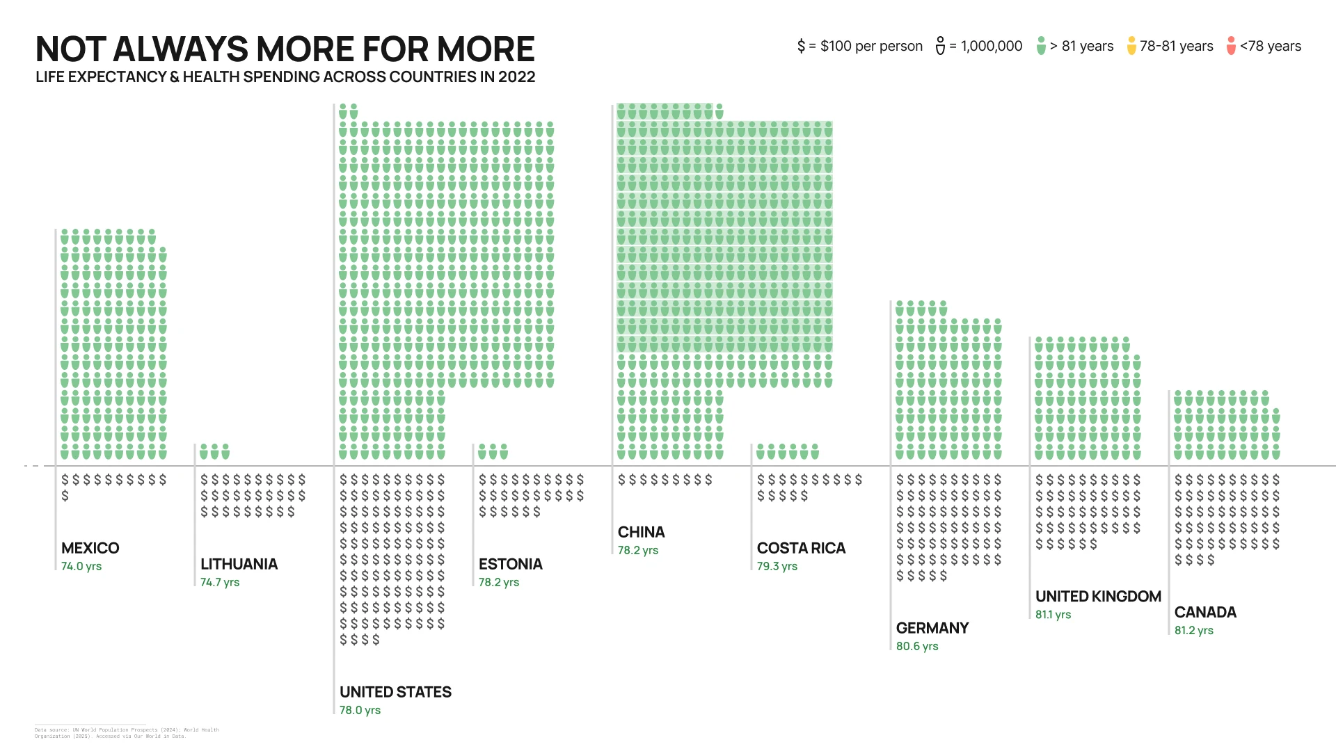
The third version. I changed the argument rather than the encoding. Among high-income OECD countries the only available story is that the United States is an outlier, so I brought in Mexico, China and Costa Rica: countries spending a fraction of the American figure and living longer. I also moved to the shared baseline and took the dollar unit back to $100.
The final version. I took three countries out and brought four in, so the set spans the full range from 74.0 to 84.1 years, and I replaced the three-band scale with a single-hue ramp. Red, yellow and green delivers a verdict on each country, and green for good is a judgement the data does not support.
Data from UN World Population Prospects (2024) and the World Health Organization (2025), via Our World in Data.
Credits
- Skills
- Information design
- Data visualization
- Unit chart design
- Visual encoding
- Editorial layout
- Tools
- Figma
- Adobe Illustrator
- Team
Design
- Zhuoqi Liu
Faculty guidance
- Todd Linkner