What’s Going on in There?
A collaborative exhibit that uses cards, colour-coded rubber bands and a physical brain map to help college students reflect on sleep and caffeine habits.
- Figma
- FigJam
- Adobe Illustrator
- Timeline
- Nov 2024 – Dec 2024
- Role
- Interaction Designer & Researcher
- Outcome
- Interactive educational exhibit
Section
What a visitor does
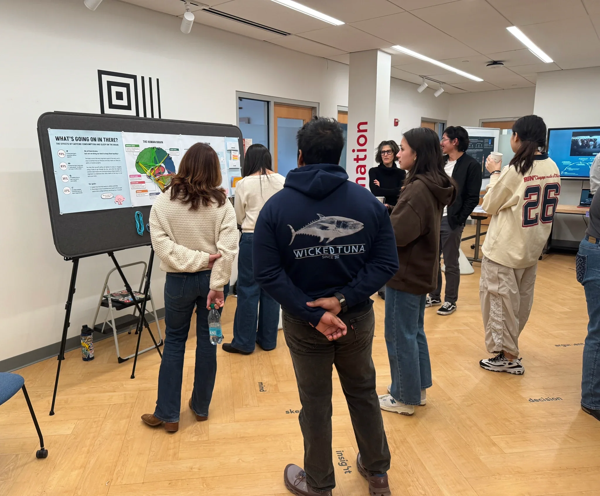
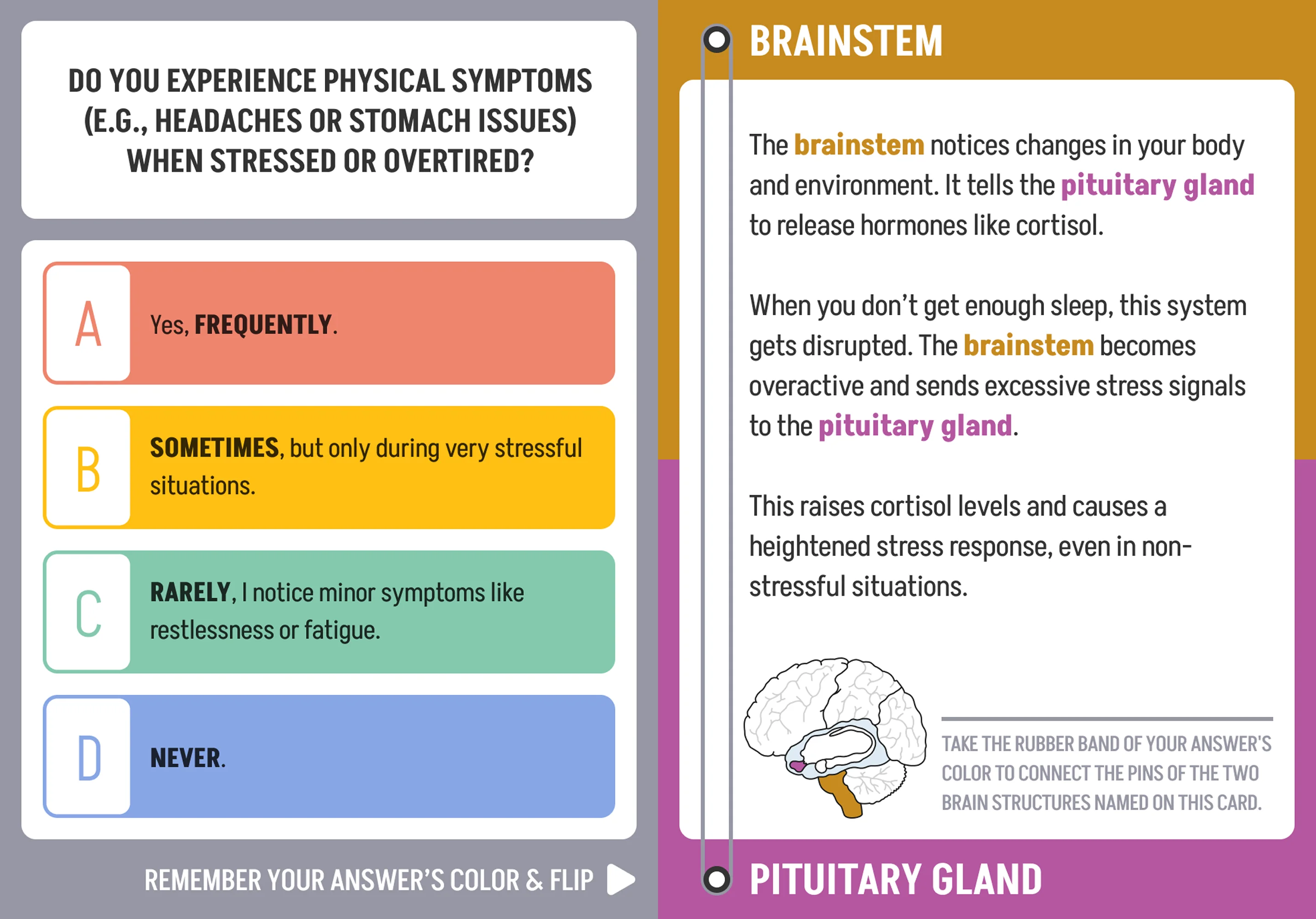
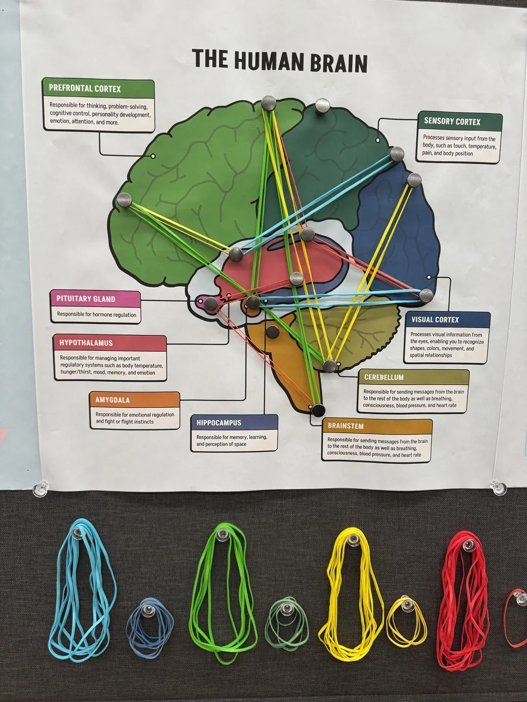
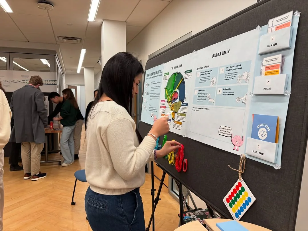
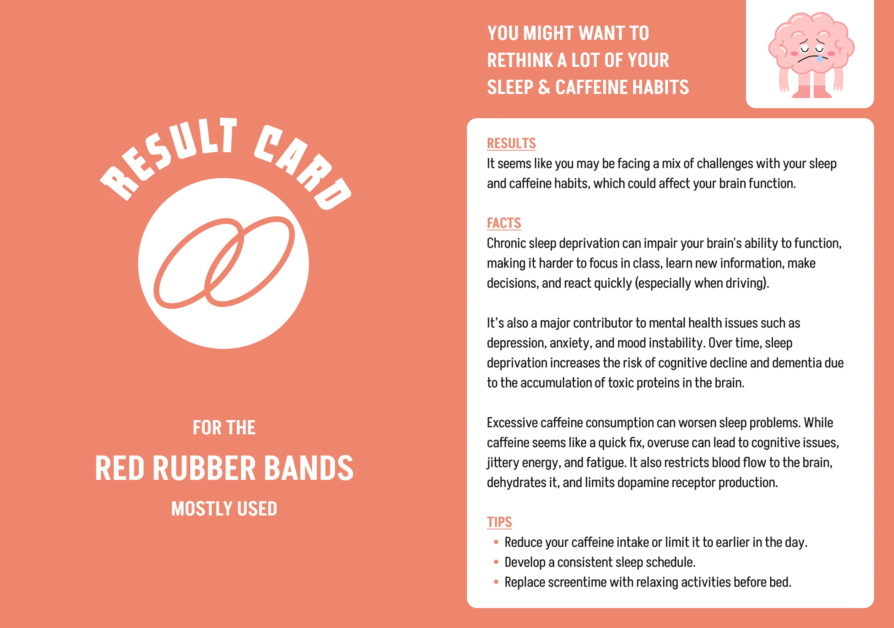
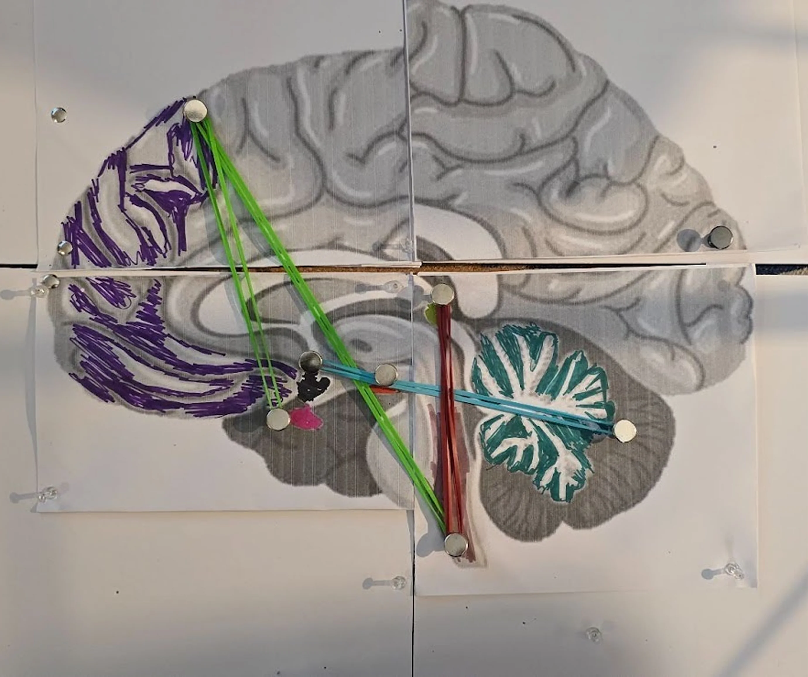
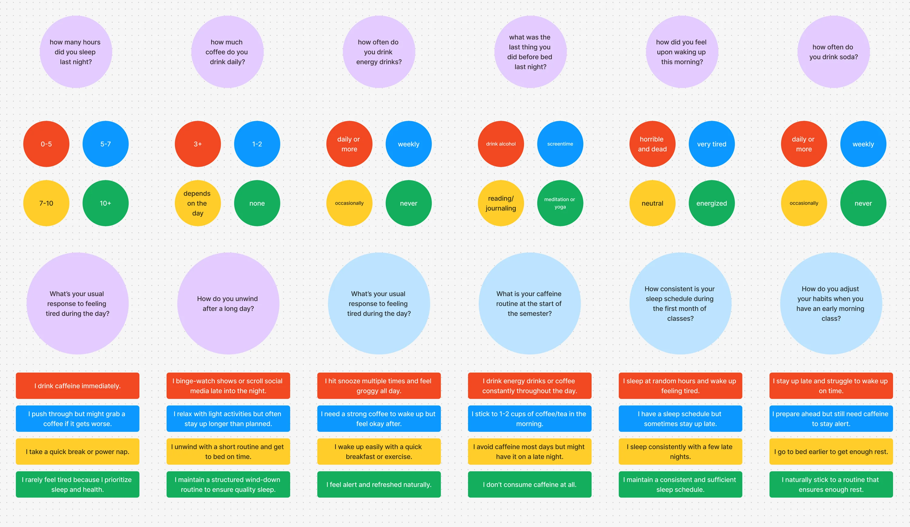
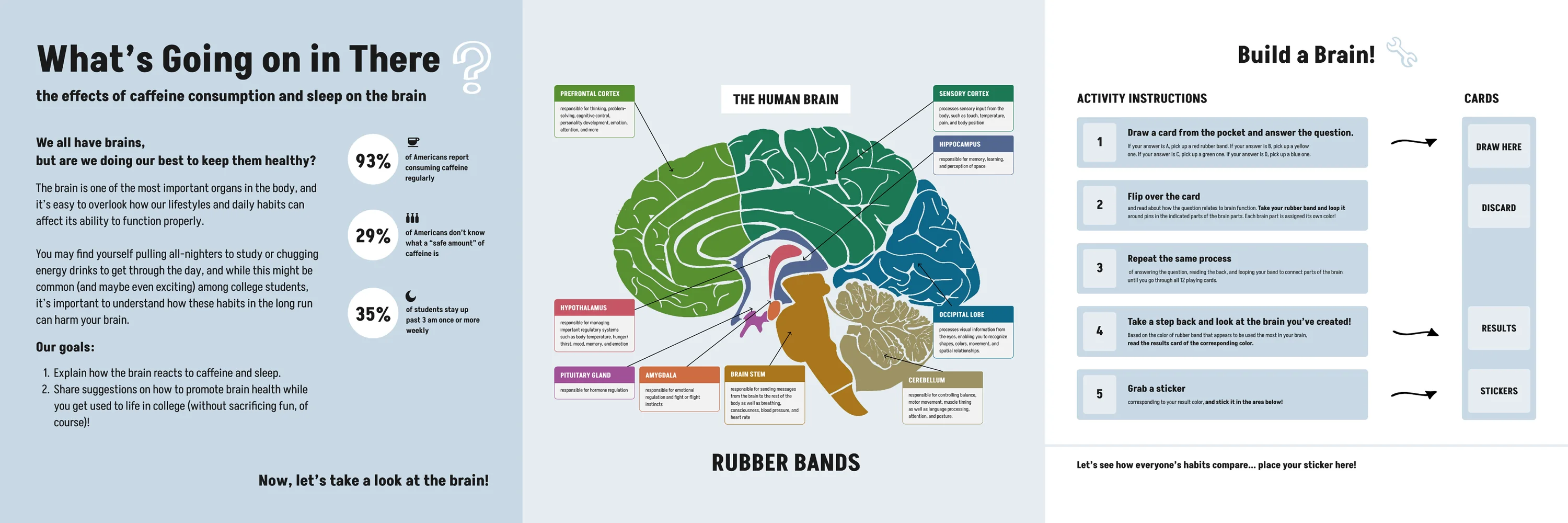
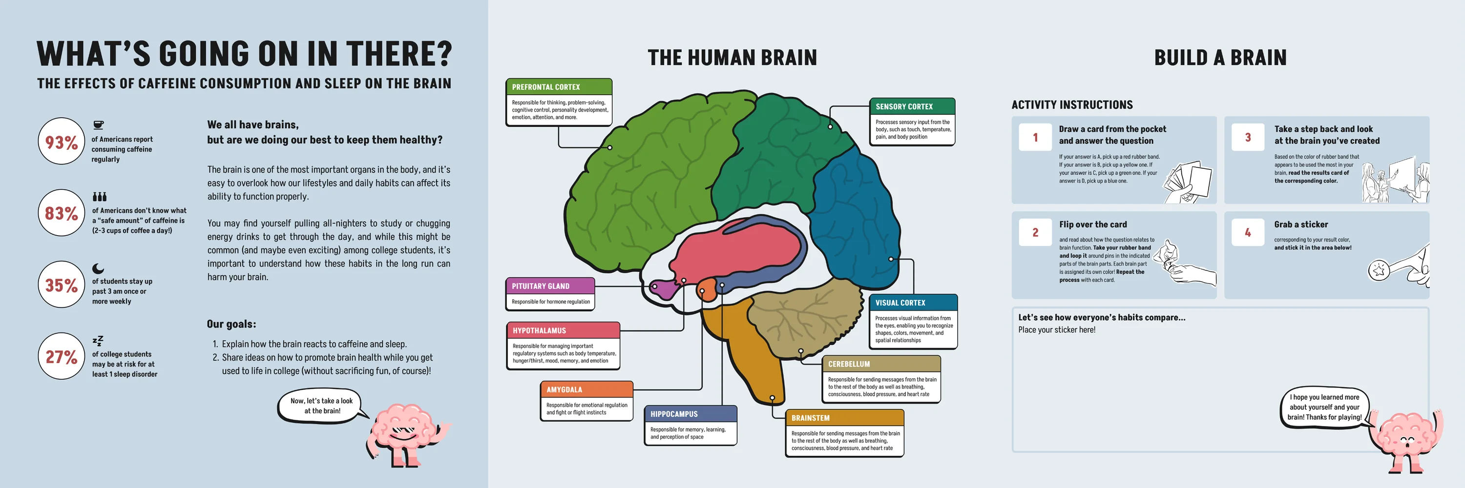
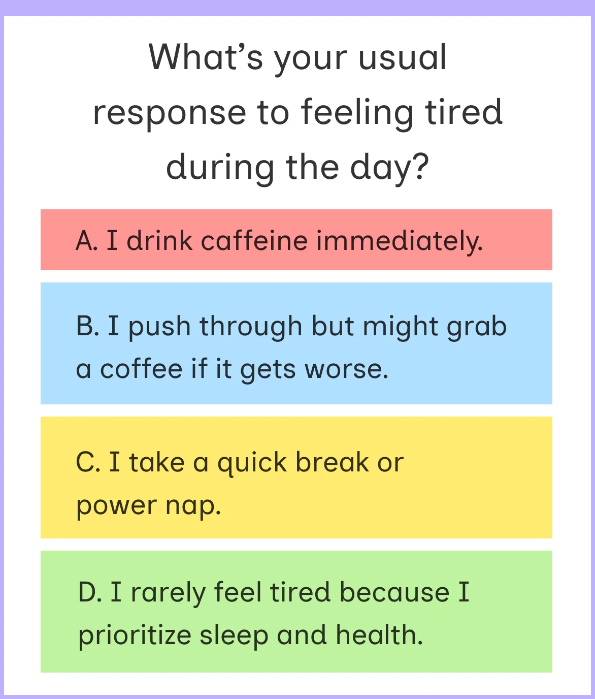
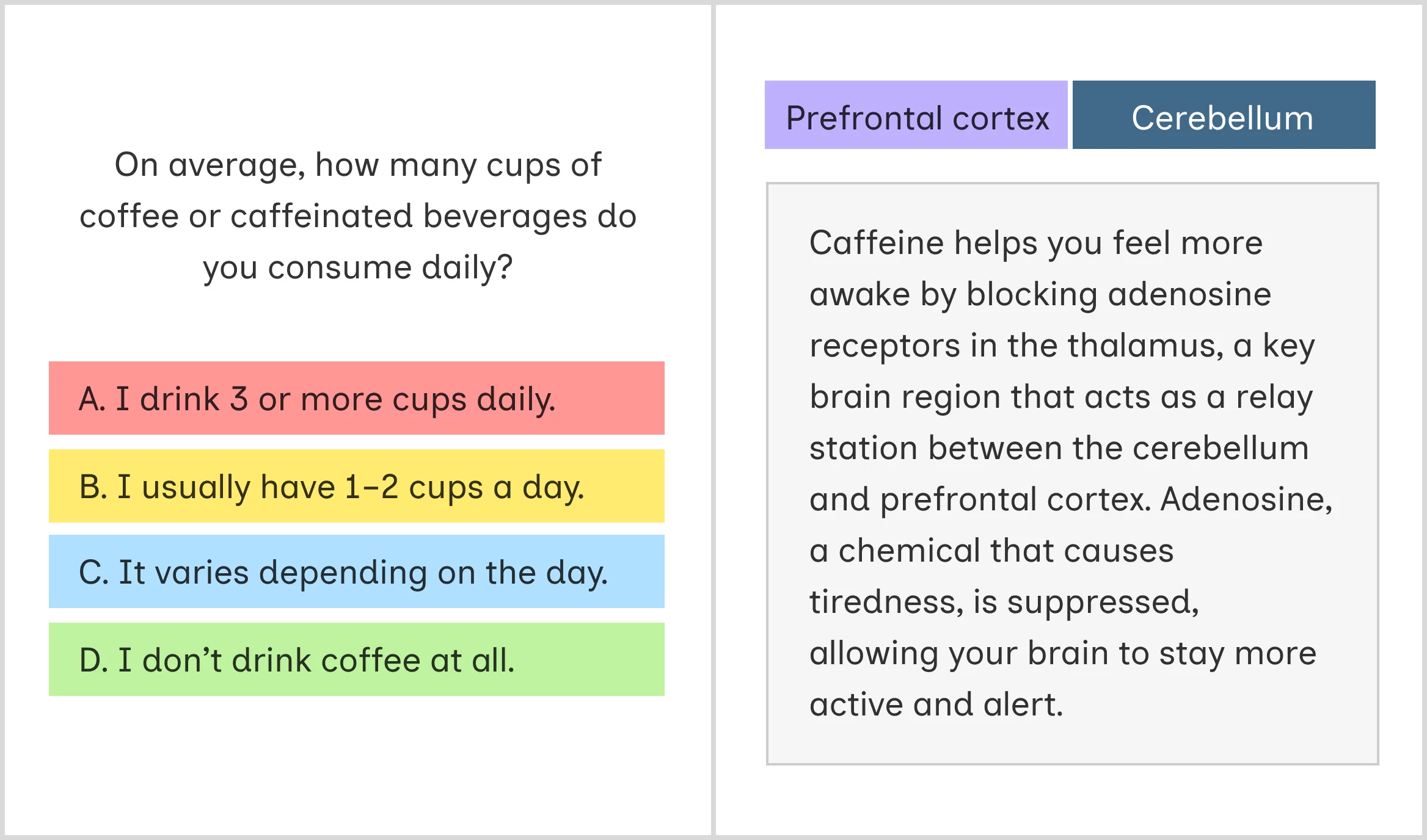
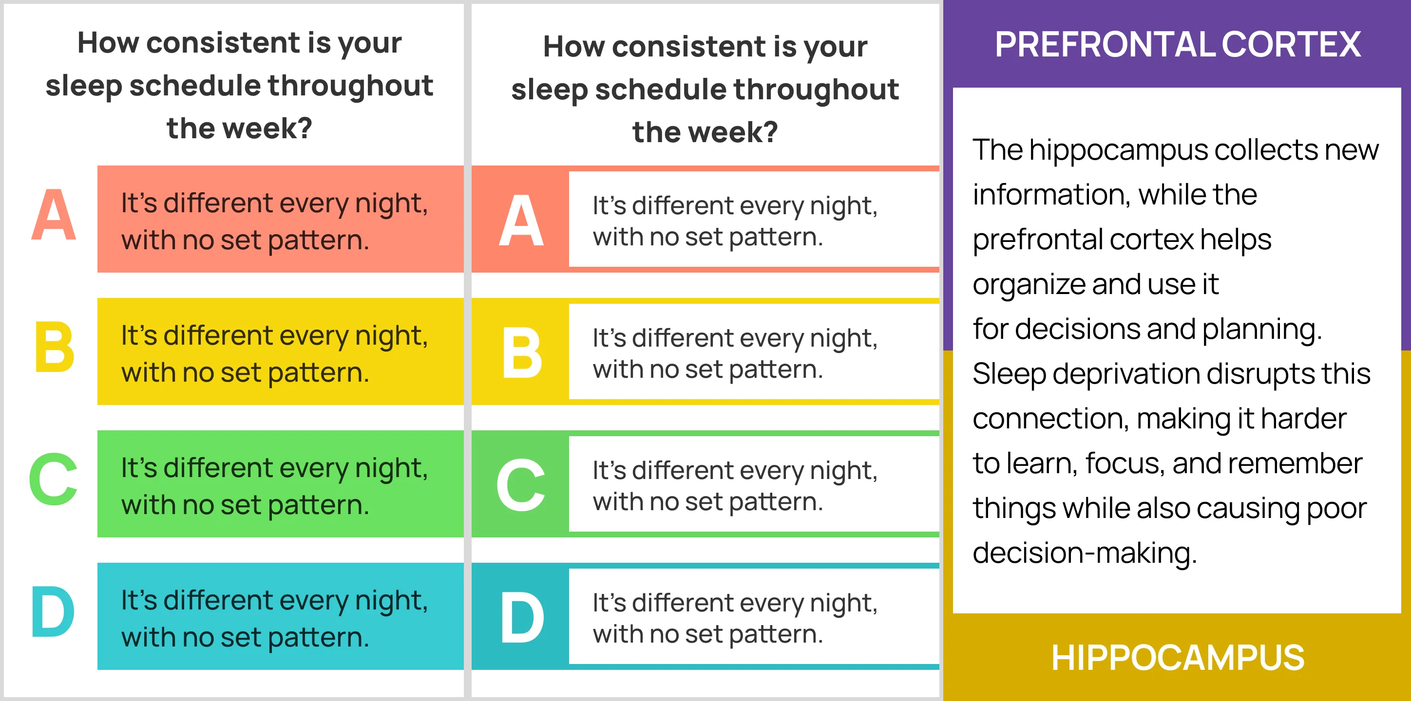
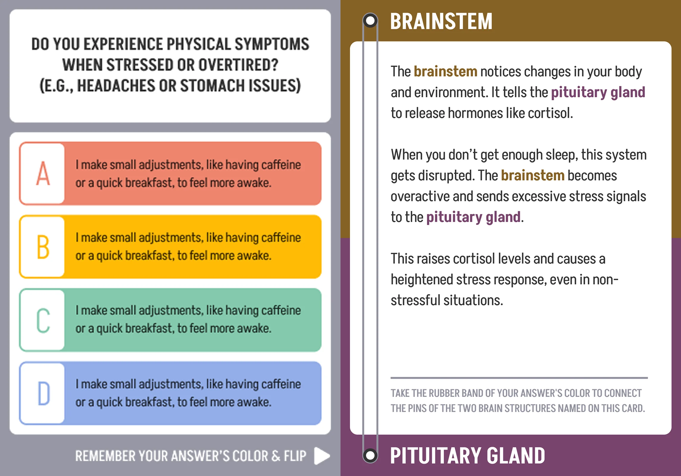
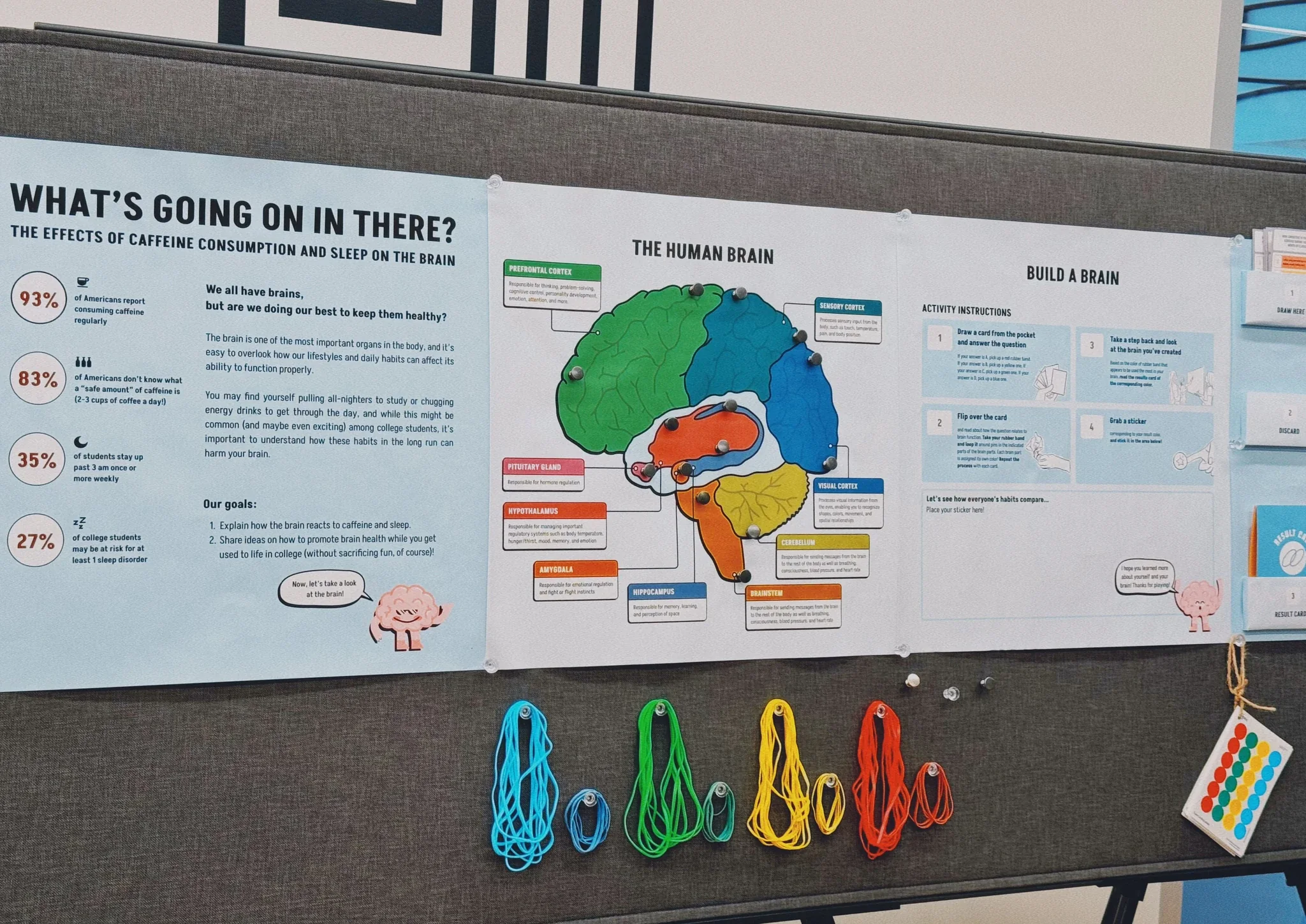
Our four-person team built an exhibit that helps college students connect everyday habits with what happens in the brain. A visitor draws a question about sleep or caffeine, picks the response closest to their own habits, and takes the rubber band in that answer’s colour. The back of the card names two brain regions the topic involves. The visitor loops the band around those two pins on the brain map, then draws another card.
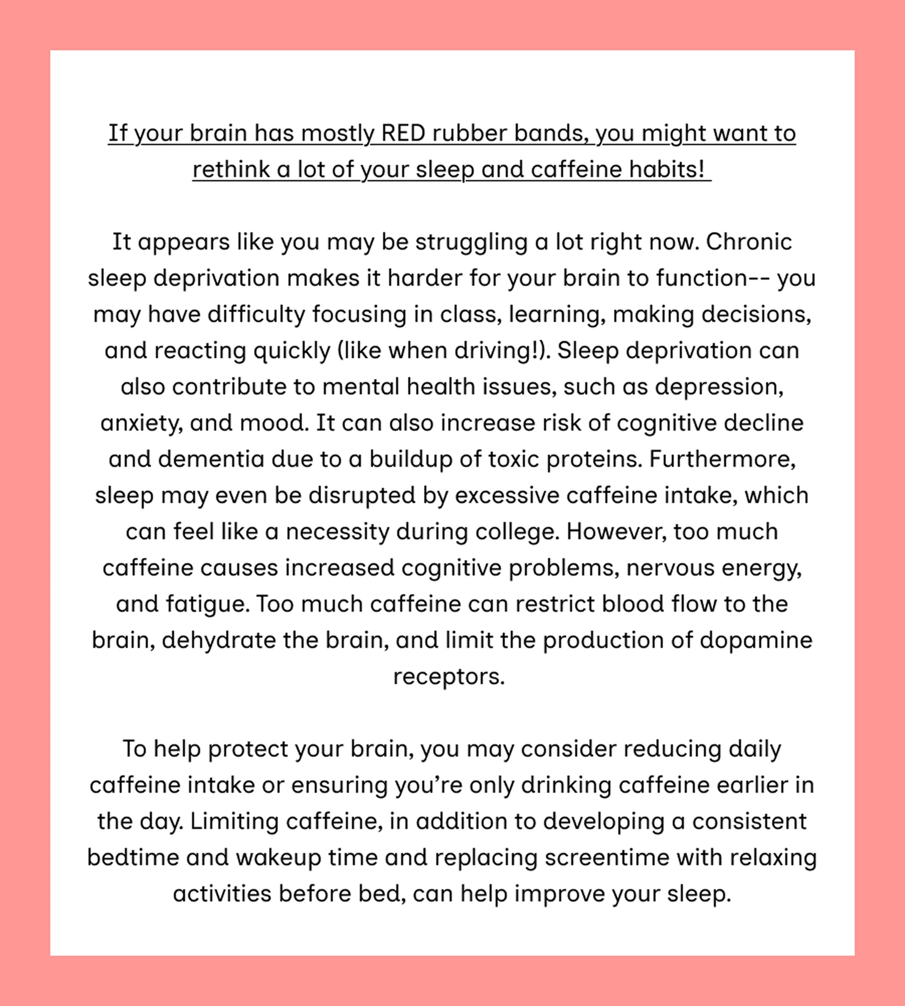
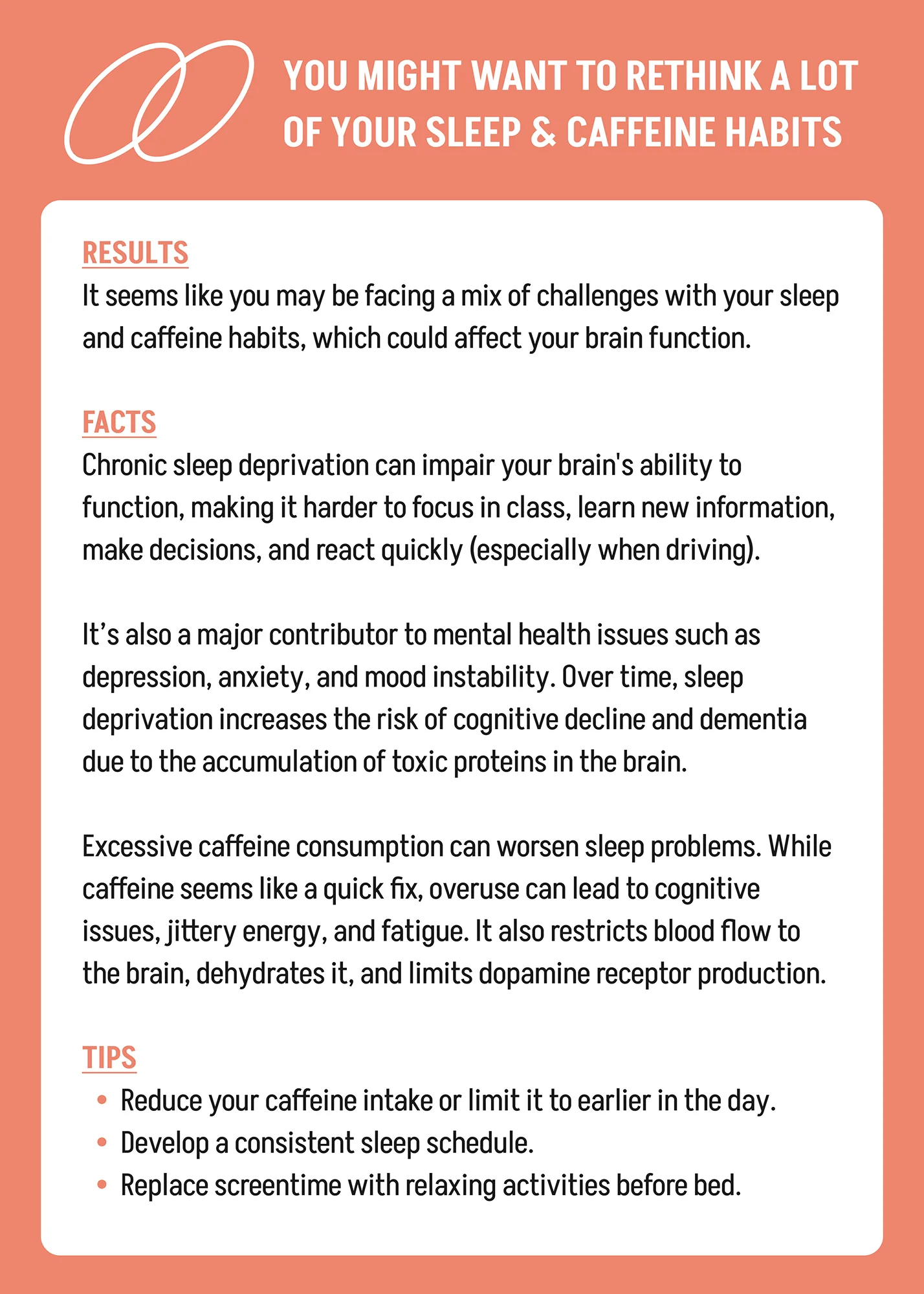
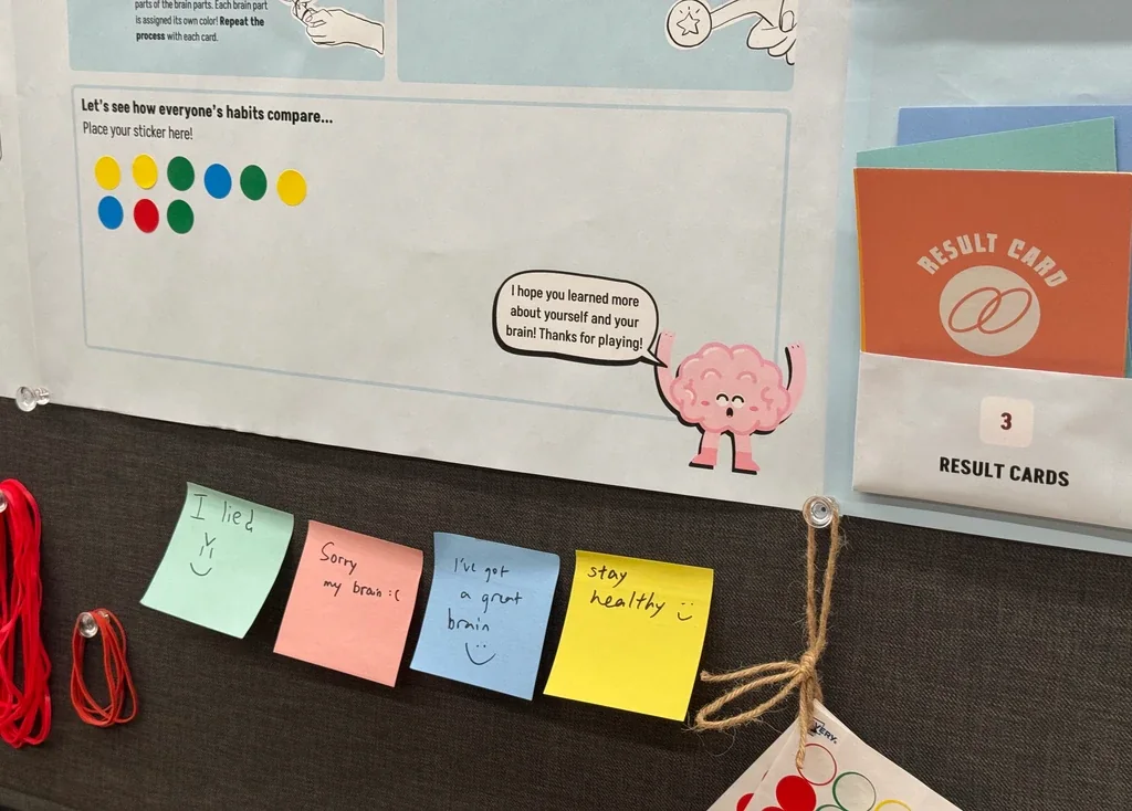
Card by card, the relationships accumulate into a network the visitor has built. At the end they compare the colour they used most often against a result card, and add a sticker in that colour to a shared board, so their result sits beside everyone else’s.
Narrowing the topic
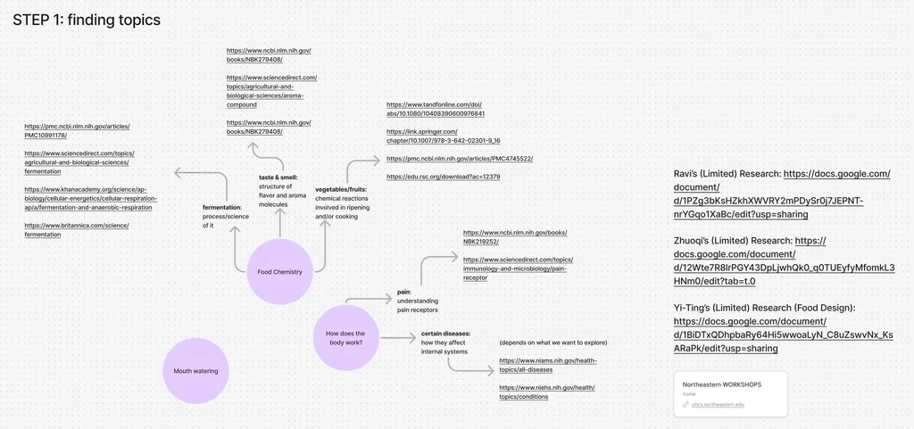
We began with a broad question about food, health and the body. Early research and topic mapping brought it down to two habits that college students already have: sleep and caffeine.
That decided the scale as well: we would cover a small set of brain regions and show how the two habits reach them.
Prototyping the mechanic
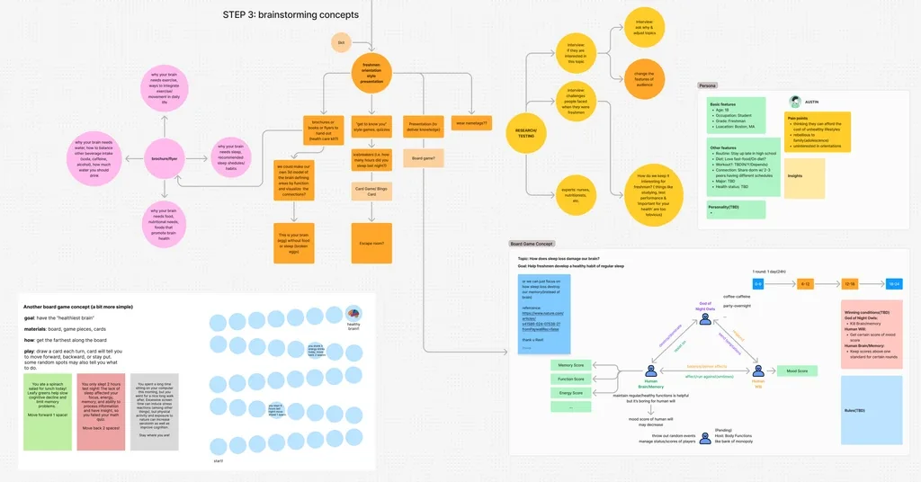
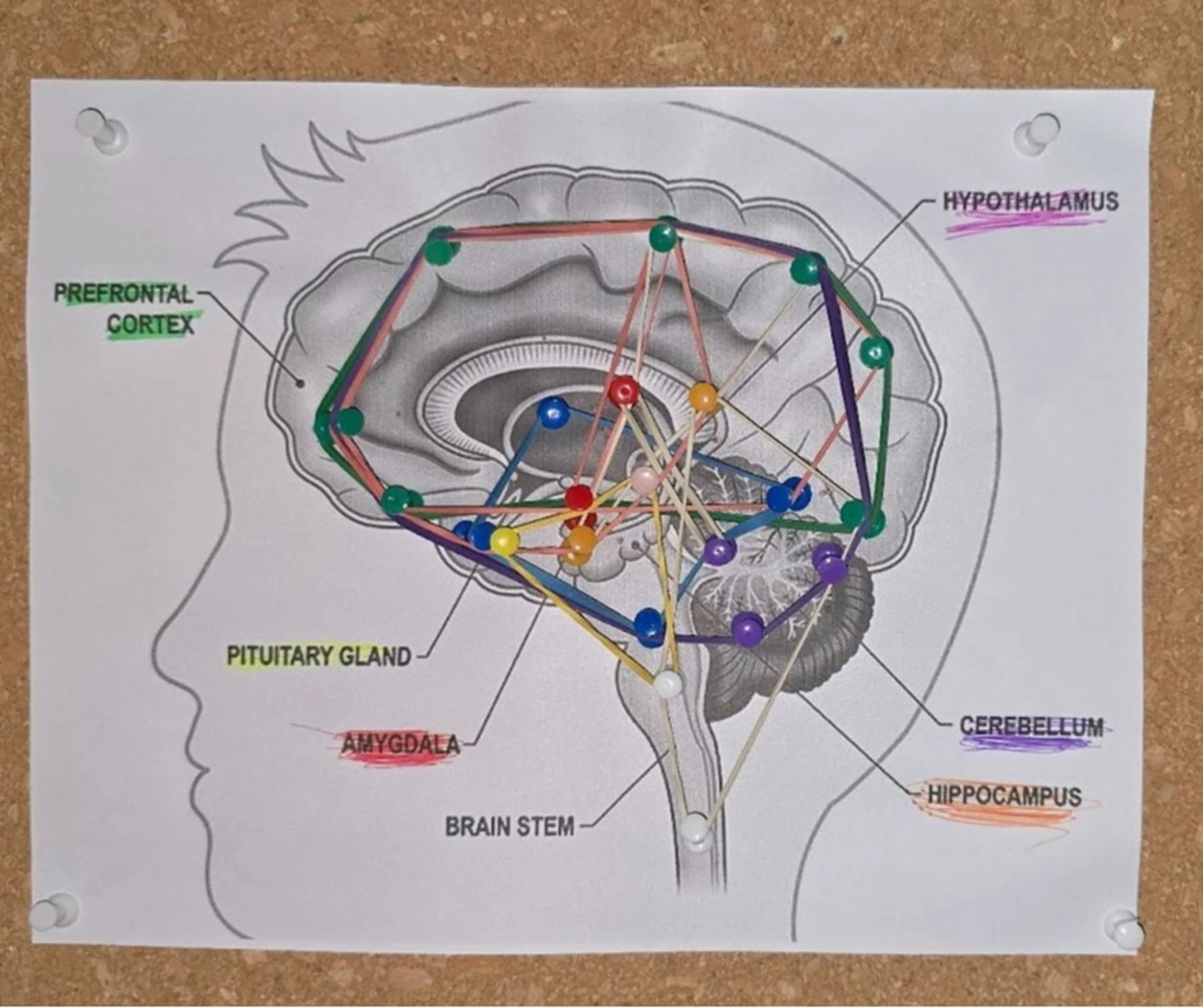
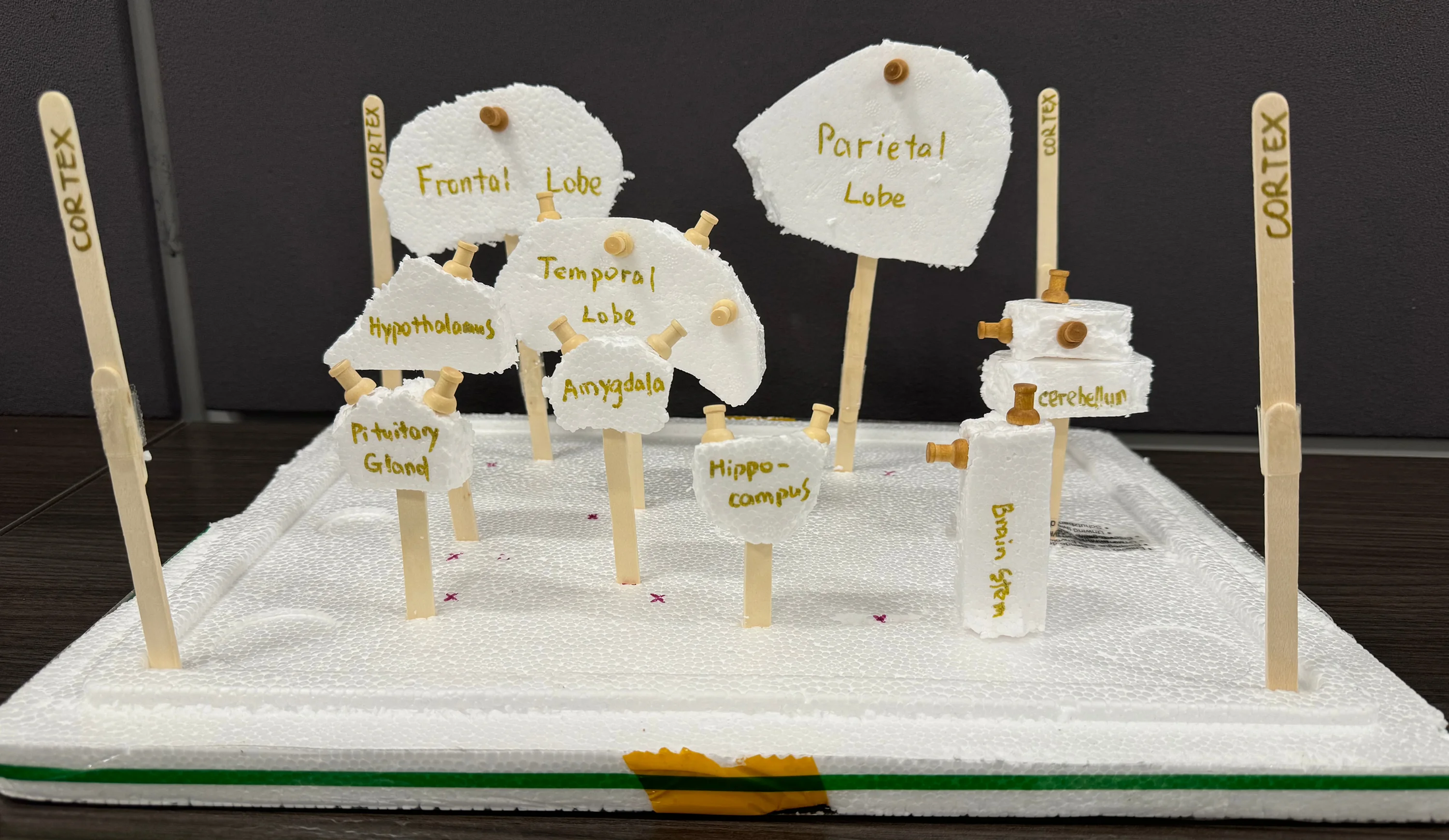
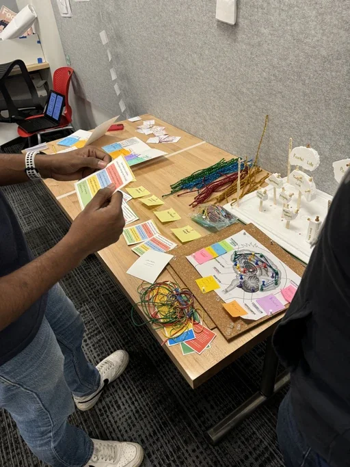
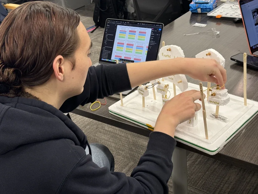
Rather than asking visitors to read another diagram, we looked for something they could work with their hands. We made the mechanic three times over. The first test pinned a brain diagram to paper and strung bands between the pins. The second moved it to cork board, with every region named. The third cut the regions out of foam and stood them on skewers.
We wrote the questions alongside, each with four answers and a colour for each answer.
Testing with different audiences
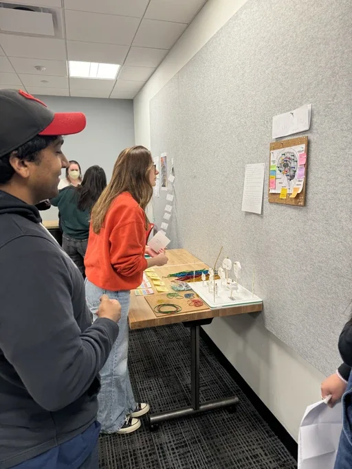
We tested with three groups, each there for a different question. Neuroscience students checked the accuracy of the brain content. College freshmen showed us whether the explanations and instructions made sense without prior knowledge. Our design cohort looked at hierarchy, readability, and how the interaction moved from card to board to result.
Most of what came back was about the words and the layout. We simplified the instructions, clarified the brain-region explanations, and made the cards easier to scan while someone was standing at the exhibit.
Iteration and the version we dropped
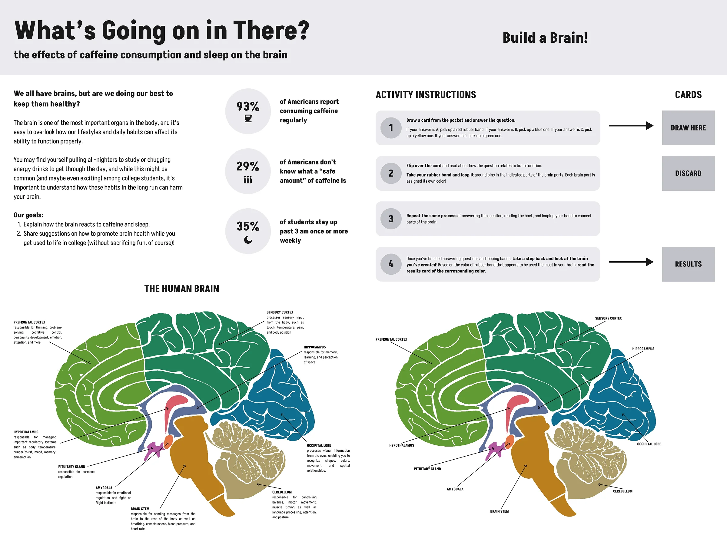
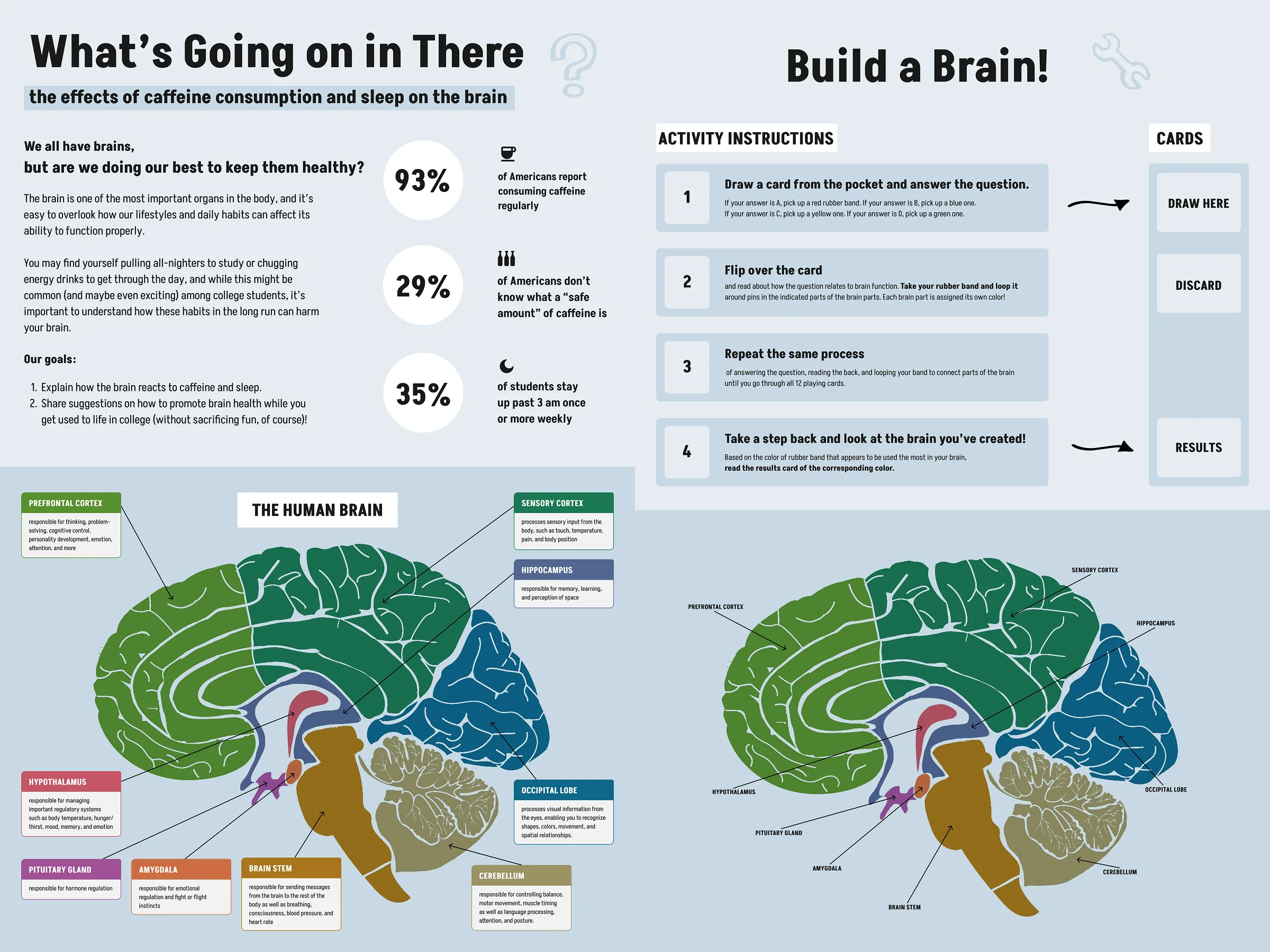
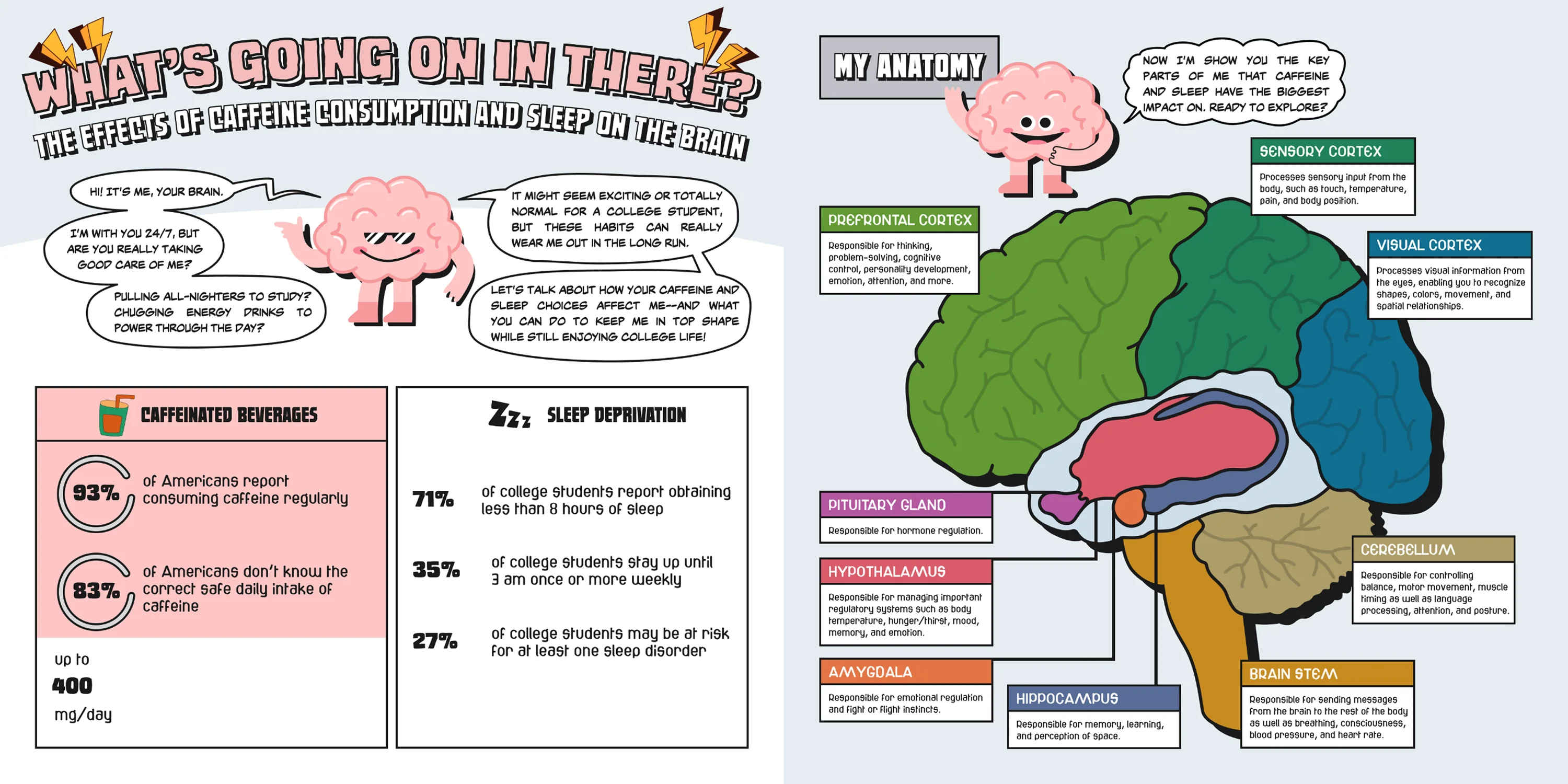
We kept redrawing the printed material long after the mechanic had settled. The exhibition panels went through five versions, the question cards five, and the result cards three.
We dropped one direction on purpose. A more illustrated, comic-like panel treatment gave the project more personality. It also competed with the brain diagram and made the exhibit harder to scan from across a room. It was unfinished, and the exhibition date was close. We returned to the simpler layout and finished that.
What came back
At the final exhibition visitors could move through the whole sequence without anyone standing over them: draw a card, answer it, connect the two brain regions, compare the pattern they had built, and leave a sticker on the shared board.
Some visitors also left handwritten notes beside the exhibit. Those comments were not part of a study. They were an unprompted sign that people were reflecting on what they had answered.
We recorded no visitor counts, no time spent at the exhibit, no accumulated band patterns and nothing about what anyone remembered afterwards. The exhibition is not evidence that the experience changed a habit or improved understanding over time.
Takeaways
Physical interaction can carry information. The rubber bands did more than make the exhibit hands-on: each answer left a visible connection, and the connections added up into a map of one person’s habits.
Different questions need different testers. Scientific accuracy, comprehension and visual clarity each needed their own kind of feedback, so no single group could have covered all three.
Simplifying the surrounding information mattered most. The core interaction stayed close to its first form while the panels, cards and instructions changed again and again to make the exhibit easier to understand and use.
Credits
- Skills
- Information design
- Exhibit design
- Interaction design
- Physical prototyping
- User testing
- Tools
- Figma
- FigJam
- Adobe Illustrator
- Team
Design
- Zhuoqi Liu
Collaborators
- Carmen Quintos
- Yi-Ting Chen
- Ravi Prasad
Faculty guidance
- Sheila Pontis