DUI’s Invisible Bill
A redesign that reframes national DUI losses through the scale of everyday household expenses.
- Figma
- Adobe Illustrator
- Timeline
- Sep 2024
- Role
- Information Designer
- Outcome
- Print infographic redesign

For my first project in Information Design Studio Principles, I redesigned an existing infographic advocating against driving under the influence. I rebuilt the argument around a question the original never clearly answered: how can the impact of DUI be made tangible in everyday life?
Diagnosing the original
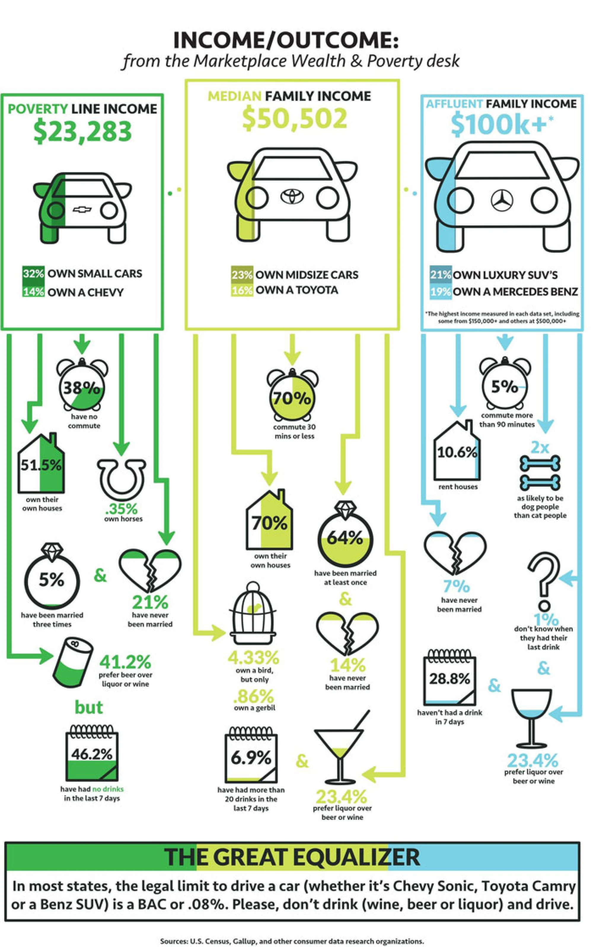
The original INCOME/OUTCOME infographic compares three income groups across car ownership, commuting, housing, marriage, and drinking habits, then ends with a warning about DUI. Most of the evidence never establishes a connection to DUI, and the hierarchy points elsewhere: cars and brand logos dominate the page, several encodings are hard to read, and unrelated lifestyle statistics compete for attention. I treated those as symptoms of one problem, which was that the argument itself needed rebuilding.
Reframing the argument
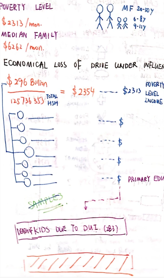
Before designing the page, I tested three possible arguments. Two depended on relationships I could not support with comparable public data: whether DUI risk changes with income, and how DUI affects different kinds of families.
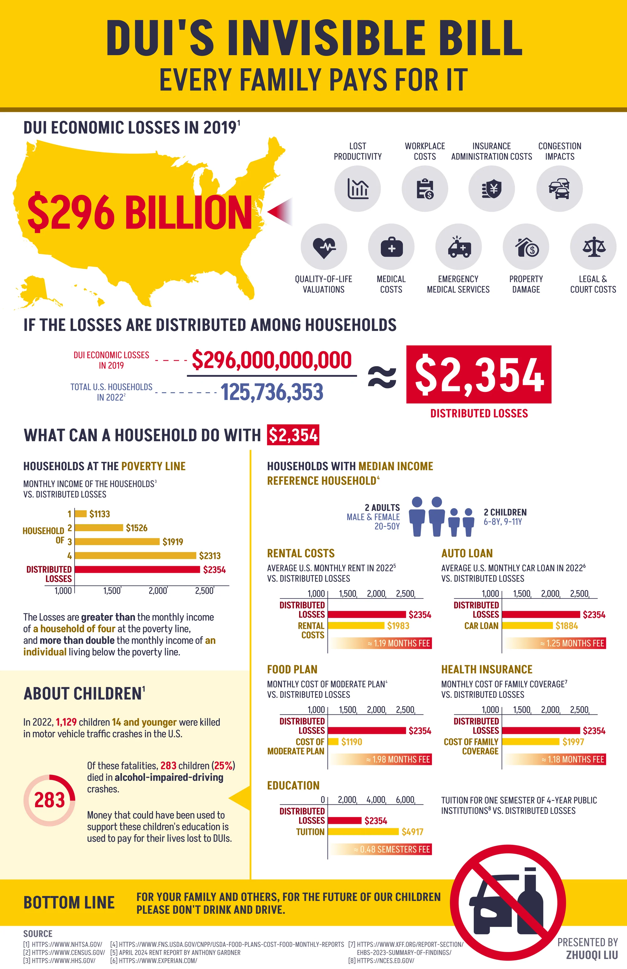
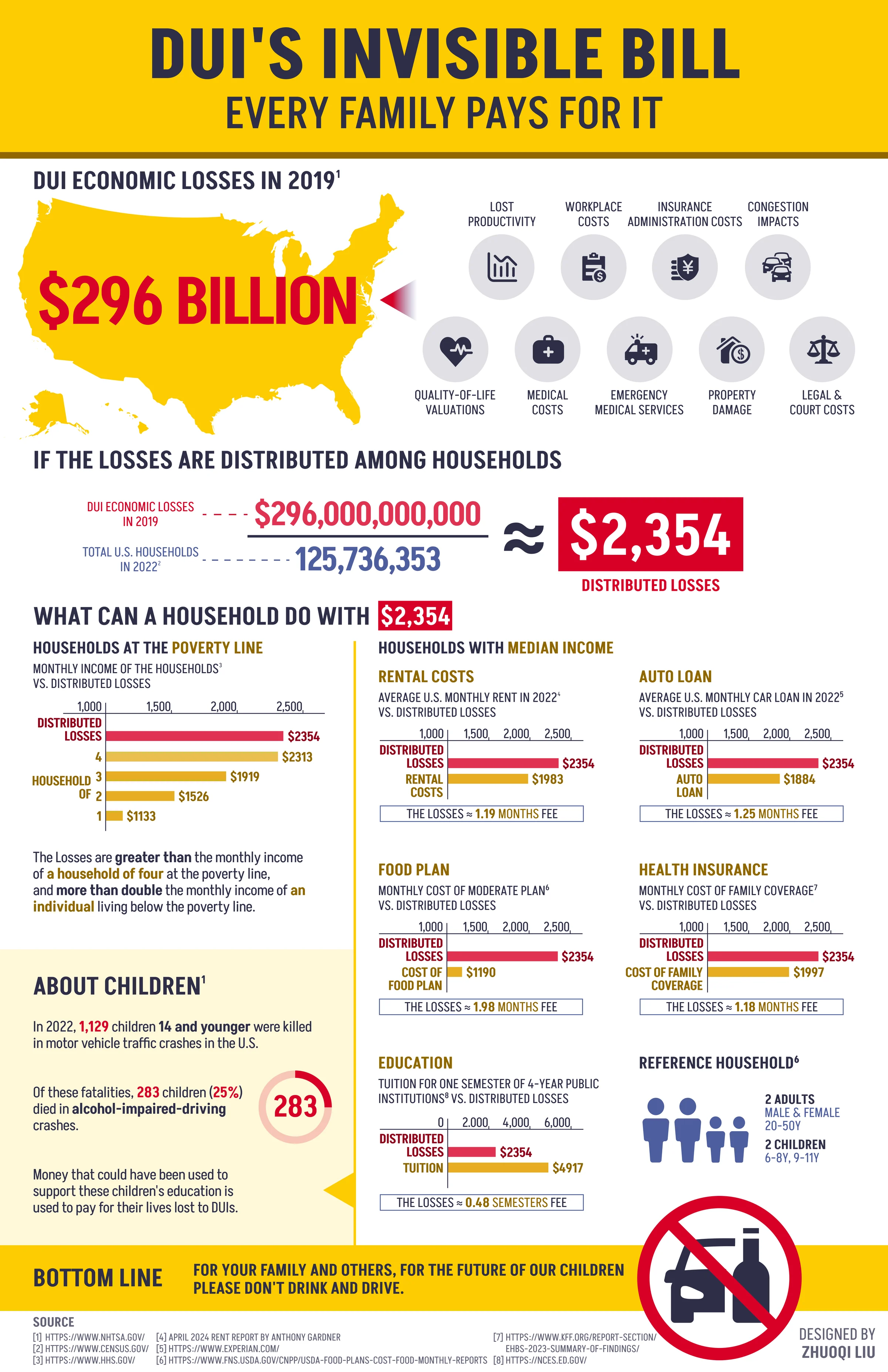
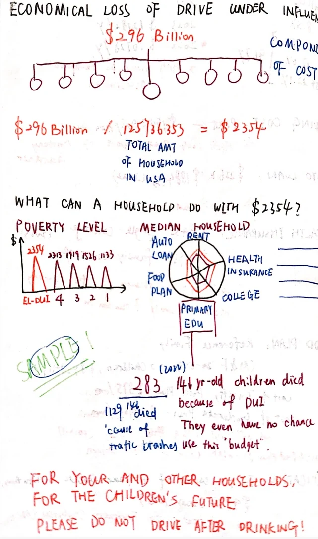
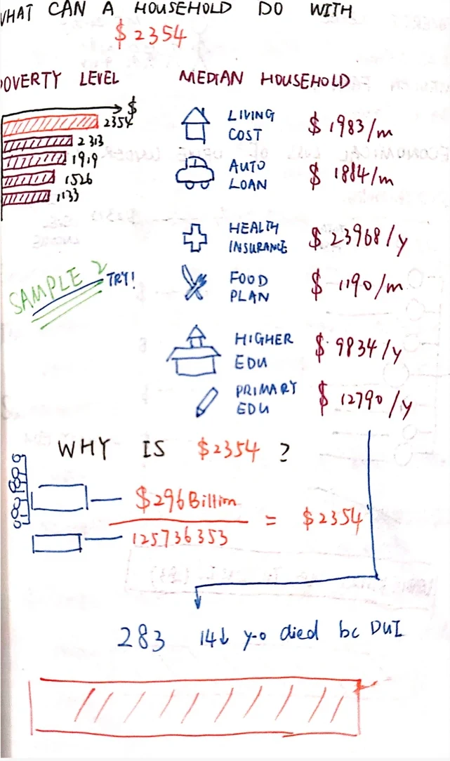
The third had public data on both sides. I took the national estimate of DUI-related losses and translated it into an illustrative per-household figure of $2,354, then compared that with rent, food, health coverage, an auto loan, and tuition. I chose that argument because the data existed to support it, not because it was the one I liked most.
Building the final story
I structured the infographic as a sequence of scales, running from the national estimate down to one household and its monthly bills, and ending on the human consequences of alcohol-impaired crashes.
Studio critique then changed the visual hierarchy. I reduced the amount of competing color, gave red, yellow, and dark blue distinct roles, and opened up the spacing for print.
Data note. The $296 billion figure is a comprehensive national cost estimate that includes quality-of-life valuations, not money directly paid by households. Dividing it by the number of U.S. households is a rhetorical comparison used to make the scale legible, not an estimate of what each household actually pays. The loss estimate is from 2019, while the household count is from 2022. Every figure carries a numbered source, printed along the bottom edge of the poster.
Credits
- Skills
- Information design
- Data visualization
- Data storytelling
- Visual hierarchy
- Editorial layout
- Tools
- Figma
- Adobe Illustrator
- Team
Design
- Zhuoqi Liu
Faculty guidance
- Sheila Pontis