Ripples into Silence
A scrollytelling visualization using ripples to tell the story of 12 years of recorded migrant deaths and disappearances around Lampedusa.
- D3.js
- JavaScript
- Python
- SVG
- Canvas
- Timeline
- Jan 2025 – Apr 2025, revised Sep 2026
- Role
- Data preparation, narrative design, and visualization development
- Outcome
- Published interactive data story
Section
The experience
Ripples into Silence follows deaths and disappearances recorded around Lampedusa, a small Italian island between Tunisia and Sicily. I wanted to explore the human cost of journeys made in the hope of starting a life somewhere new.
I built the piece so a viewer first watches the records appear one after another, then compares the years, and finally sees the people inside the total. The current version covers 95 records from 2014 to 2025, which together count 833 people recorded as dead or missing.
Choosing the frame
My first version, Northbound: A Deadly Voyage, set out to show migration across the whole Mediterranean. It placed countries of origin, transit, and destination in three tiers, with arcs for routes, causes of death, and the number of people lost.
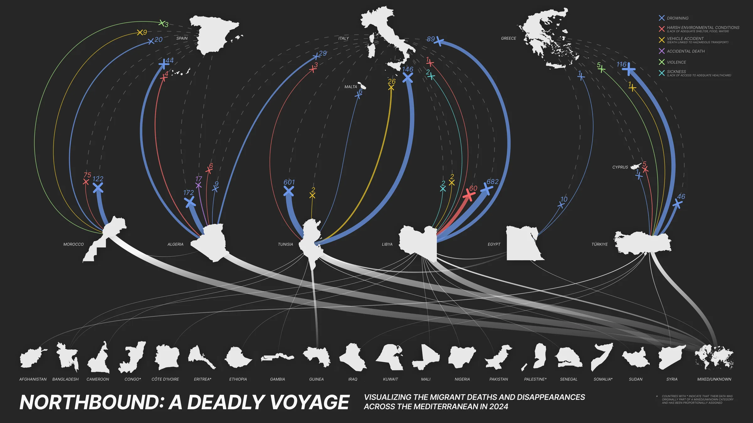
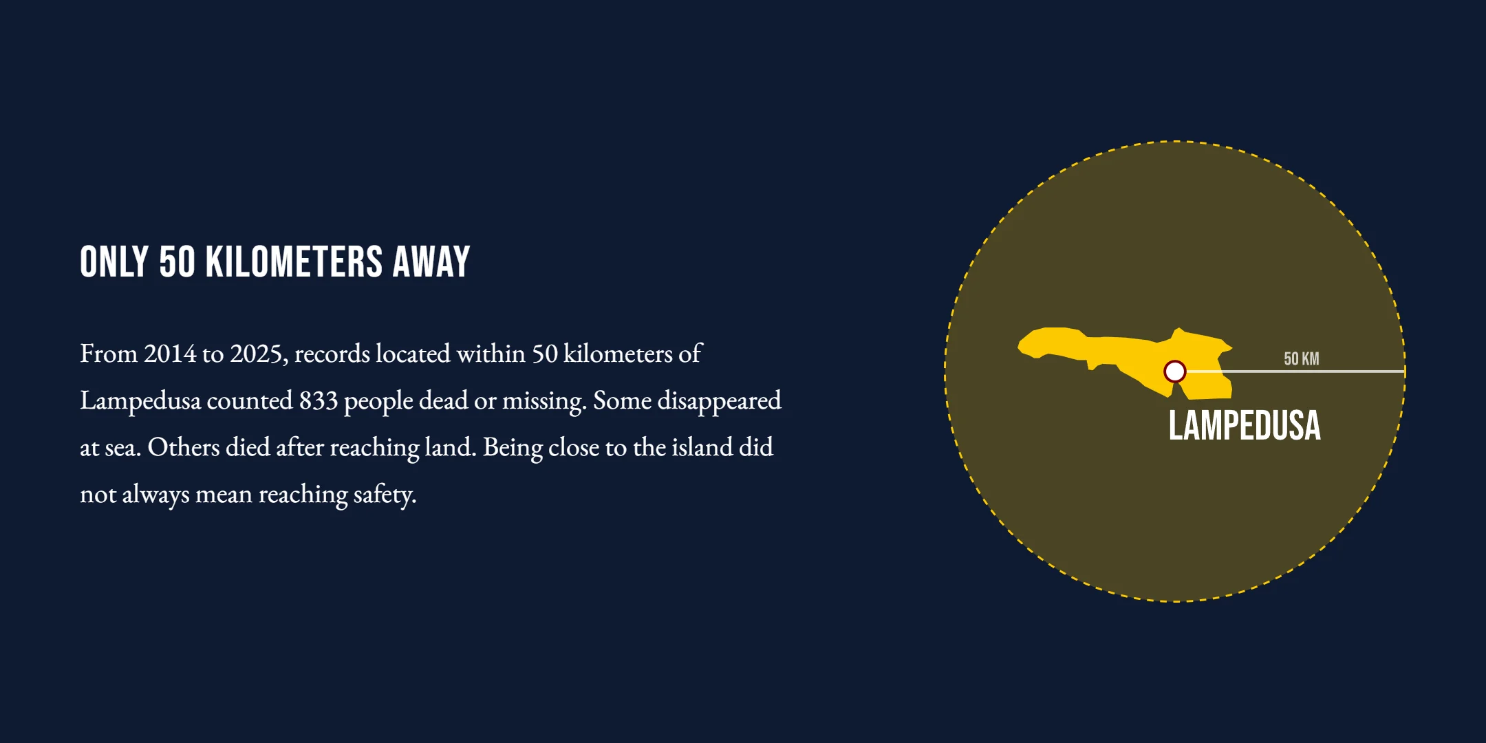
I found the composition lacked a clear entry point. Keeping the same source, I narrowed the frame to Lampedusa, an island on a central Mediterranean route, so the piece could start from one place.
The 50 km radius is a focus I chose. I applied it by measuring each record’s coordinates against a reference point on the island and keeping the records inside the radius. A coordinate can mark an incident, a rescue, the discovery of remains, or an arrival, so it may not be where a person died.
Data scope and limitations
The source is a CSV export of the IOM Missing Migrants Project, supplied in September 2026. The snapshot covers records through December 2025 and should not be treated as a complete account of all losses.
I kept unique Main IDs dated 2014 to 2025 within 50 km of a reference point on Lampedusa, measured from that single point. The piece’s data and method notes give the coordinates, the distance formula, and the script that rebuilds the sample and records the source’s hash.
A Main ID is a record, not a boat, and records with the same date and coordinates stay separate. The 95 records count 833 people: 199 in the dead field and 634 in the missing field. Blank fields are not counted as confirmed zeros.
The sample differs from the one the 2025 version used. Split rows were merged, some historical records changed in the source, other records are new, and 2025 is added. Four records whose location text disagrees with their coordinates, such as one described as 100 km northwest of Lampedusa that sits at 7.65 km, carry a note and stay in the sample. They are the discrepancies found in review; other coordinates were not checked against their descriptions.
Giving the records a rhythm
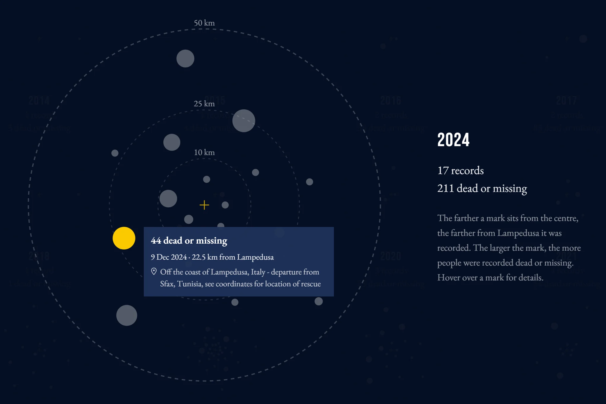
I used fading ripples as a metaphor for lives lost at sea. A ripple appears, spreads, and disappears, giving each record a brief presence before the surface grows quiet again. What stays behind is a thin ring at the record’s distance from the island, sized by the number of people it counts. I fixed the distance scale to the frame, so each record’s ring and the 10, 25, and 50 km guides read off the same ruler. Radial position encodes distance; direction and movement do not represent actual routes.
I slowed the opening so the encoding can be learned from a few records. The first five appear one at a time, each labeled with its distance and its count, and the rest follow in date order.
Playback follows date order without reproducing the gaps between events. After the opening, I used a largely steady pace, allowing more time for years with more records.
Watching one record at a time makes comparing years a matter of memory. So after the animation I drew each year as its own disk, with the same rings and size scale for all 12, and set them side by side.
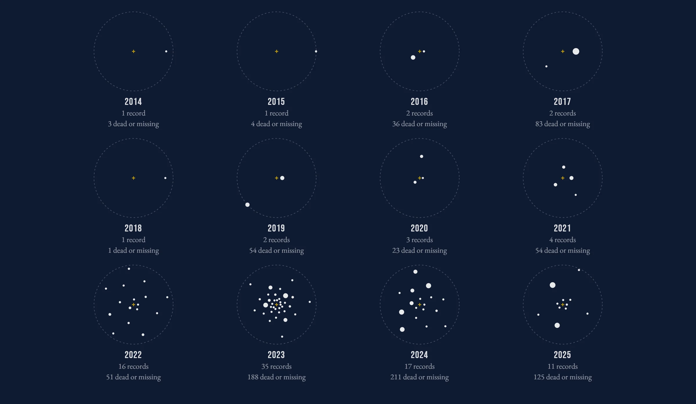
Any disk opens at full size, and hovering a mark gives its count, date, and distance. I retained the source’s location descriptions in the tooltips so viewers could read the context behind each coordinate.
From records to people
In the disks, one mark is one record, sized by the number of people it counts. For the last step I wanted to move attention from the records to the people inside them.
As the reader scrolls, I let the marks leave their disks, draw together, and split into 833 equal circles, each record into as many circles as it counts. The circles pass through an outline of Lampedusa and then settle into groups by the cause reported for their record. The outline is a visual device that holds the 833 together for a moment; it does not show a journey or mean these people reached the island.
I kept the transition continuous so viewers could follow the same records into the person-level view. Every circle comes from a mark in an annual disk, and scrolling back returns it to that mark.
Cause groups reflect the source records, not individually confirmed causes for every missing person. I kept multiple causes together rather than assign individual people to causes the record does not distinguish.
Playback and implementation
The record and the disks are SVG, drawn with D3.js. The 833 circles are drawn on a canvas, which takes over each white mark where the SVG drew it; the SVG marks are then hidden so the two never overlap.
The transition has no clock of its own: the scroll position inside the pinned stage sets every circle’s position, so a reader who stops halfway holds halfway. The record runs on its own clock, and only while it is on screen. After the opening, the records in most years take equal slots on the time bar, and a year with only a few records is given at least enough width for its label. The bar’s years are therefore not a calendar scale.
Each circle keeps the Main ID of its record, which decides the mark it leaves and the group it joins. A repository test checks that all 95 records produce the correct number of circles, that the total is 833, and that the seven cause groups have the expected counts.
With reduced motion requested, the disks appear filled, the transition changes straight from the disks to the groups, and the epilogue’s lines appear together. The record’s paths still animate.
Credits
- Skills
- Information design
- Data visualization
- Scrollytelling
- Data preparation
- Creative development
- Tools
- D3.js
- JavaScript
- Python
- SVG and Canvas
- Roles
Design and development
- Zhuoqi Liu
Faculty guidance
- Todd Linkner
- Note
Claude Code assisted with parts of the implementation and with optimizing the code.