Transit-Oriented Development in Greater Boston
A model that ranks 251 development sites beside MBTA stations, and tests how much its answer depends on the weights behind it.
- Python
- pandas
- scikit-learn
- Matplotlib
- GeoPy
- Leaflet
- Timeline
- Oct 2024, rebuilt Sep 2026
- Role
- Data Analyst
- Outcome
- A site-selection model, and a 22-site shortlist with three possible winners
Section
From policy to a site-selection problem
In January 2021 Massachusetts told the 177 communities the MBTA serves to zone for multi-family housing near a station. Every one of them now has a district where multi-family housing is permitted by right, somewhere near a train. The law settles where housing must be allowed and leaves where it should go entirely open.
The question
Of everywhere the law reaches, where would a development of homes, shops and workplaces actually work, and what would it cost?
Ridership has to justify the density, land has to be cheap enough for the sums to work, and the site needs room to grow. No single measure carries all three, so the answer comes out of a weighted model, which makes the weights the whole argument.
I have answered it twice. The first version was a course project in autumn 2024; the second is a rebuild I started this year after going back to the first. They point to different places, and most of what follows is an account of why.
Two methods for the same question
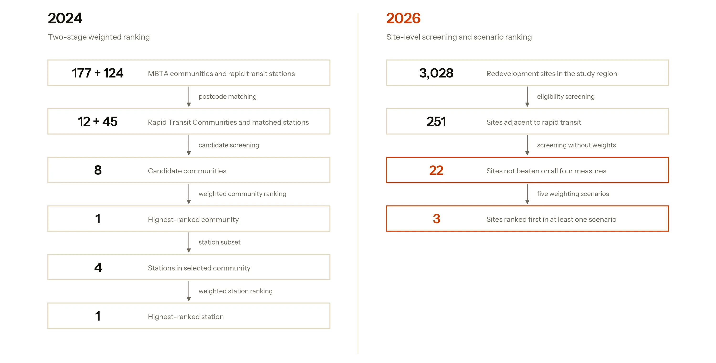
The 2024 model ran in two stages: rank the communities that hold rapid transit stations, take the highest-ranked one, then rank the stations inside it. It returned Quincy Center, and an estimate of about $482M for a building of 500,000 square feet, a fifth of it shops and the rest homes and workplaces. The 2026 version works on individual redevelopment sites in one pass, and returns a shortlist. Both are drawn below at the same scale.
What the 2024 model got right. Its screening is sound: the zoning obligation really does apply at community level, and restricting to communities with a rapid transit station really does define the candidate space. The indicators are the right kinds of thing to measure, each one has a written justification, and the cost model is sized against two built Quincy projects.
Where the 2024 model falls short. Everything it decides, it decides one resolution above the thing being chosen. A development goes on a parcel; the model scored towns, and fed itself town averages to do it. Choosing one community discards seven before any station is examined. Two of the station indicators turn out to measure the same quantity. And every number is drawn from a single season that later turns out to be a trough.
What the 2026 rebuild changes. One stage instead of two, scored at parcel level, with the shortlist produced before any weight is applied and the weights themselves treated as a set of positions to be compared.
| 2024 | 2026 | |
|---|---|---|
| Unit of analysis | community, then station | individual site |
| Stages | two | one |
| Candidates evaluated | 8 communities, then 4 stations | 251 sites across 9 communities |
| Indicators | 5 community, then 4 station | 4, checked for redundancy |
| How indicators are scaled | best in the sample scores 1, worst scores 0 | each site's standing among all 3,028 regional sites |
| Shortlist before weighting | — | 22 sites that nothing else beats outright |
| Weighting | one set of weights | five weighting scenarios |
| Ridership vintage | Fall 2023 | Fall 2025, with a 2017–2025 panel |
| Output | one recommended station | ranked shortlist, three scenario winners |
How the flaws surfaced
None of this was visible from inside the 2024 notebook. Each problem came out of a check I had not run at the time.
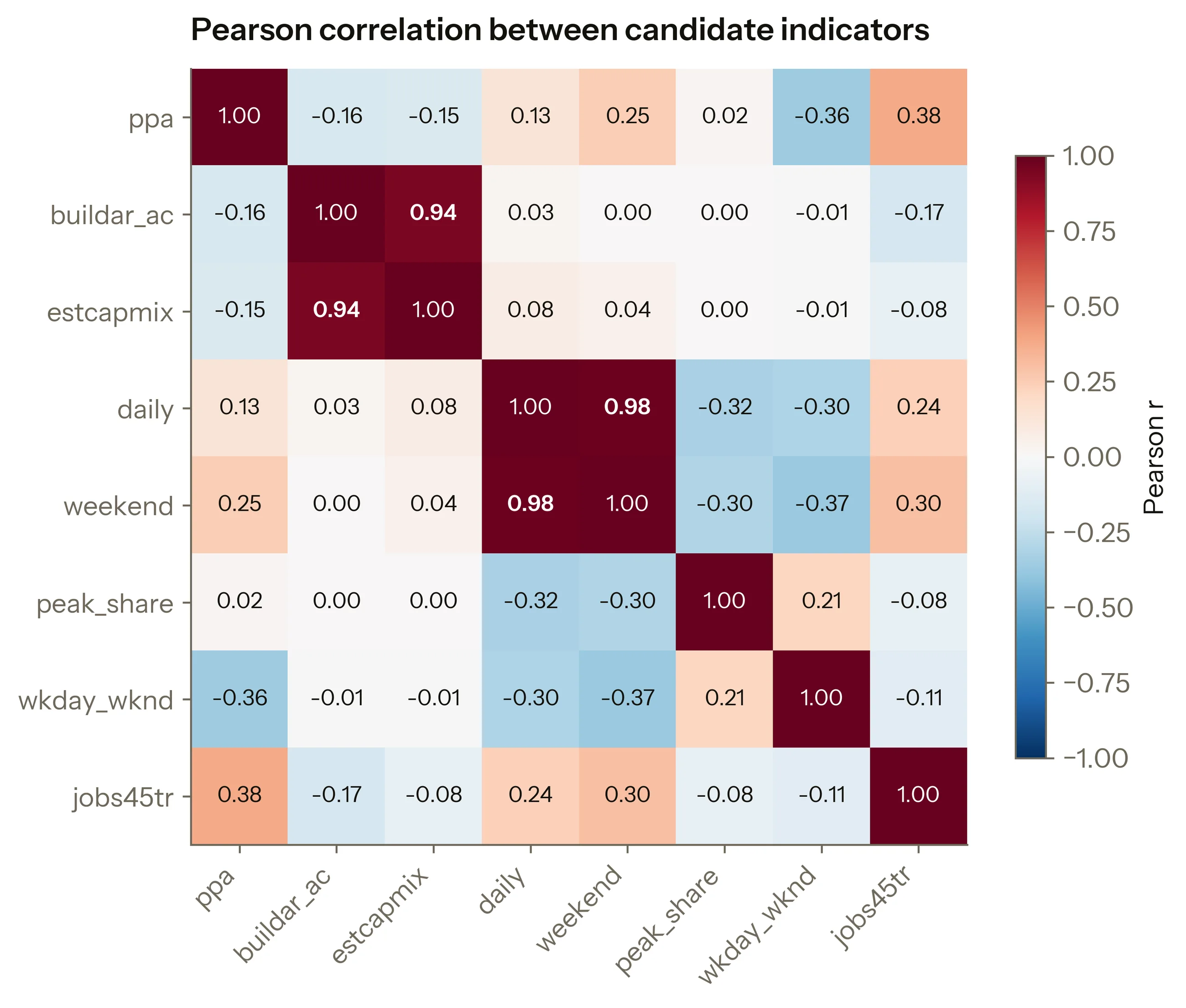
Correlating the indicators against each other. The station model gave daily ridership 40% and weekend ridership 20%. Across the rebuilt candidate set those two correlate at 0.98, so sixty per cent of the weight sat on what is effectively a single quantity. Buildable area and estimated capacity repeat the pattern at 0.94. The weight table said something the arithmetic did not do.
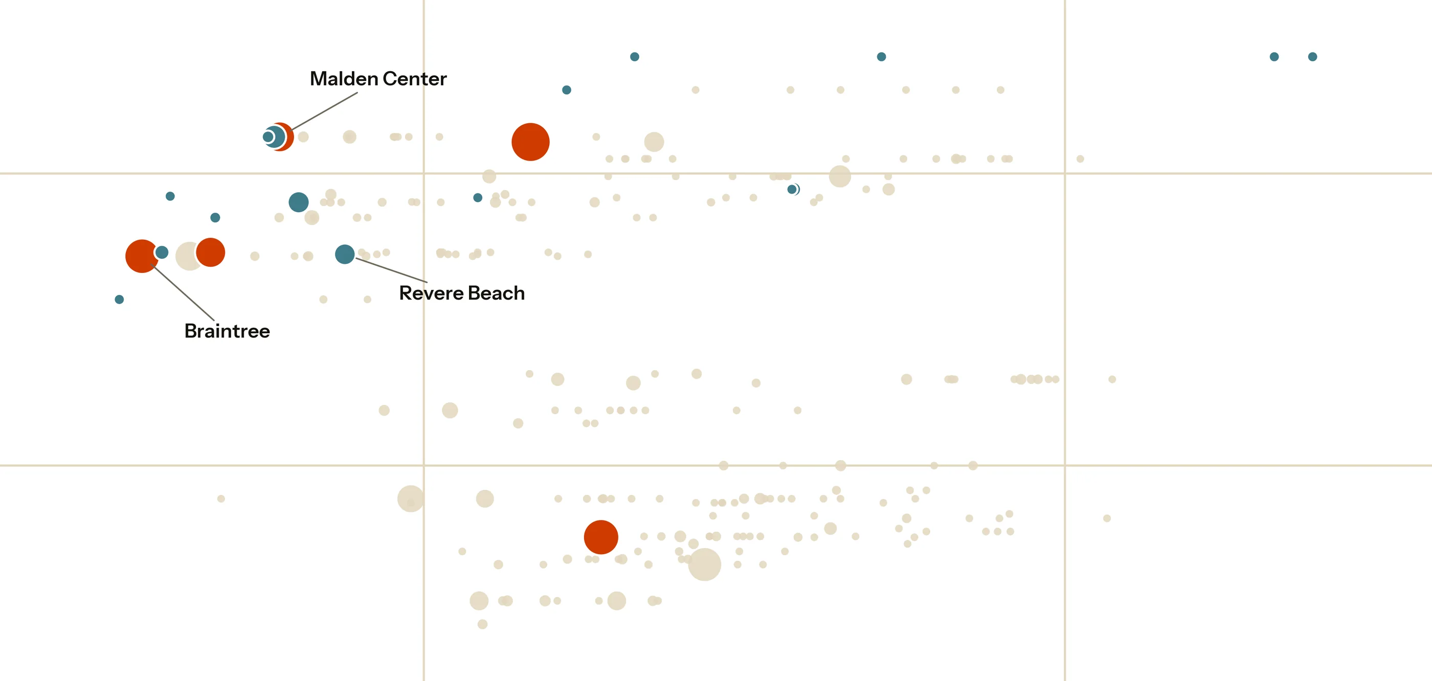
Opening up the land price column. Land price carried the heaviest weight in the community model, 30%, and it entered as a municipal average. Inside Quincy alone, the price per acre of the actual redevelopment sites runs from $335K to $4.06M, a 12-fold spread. A town average cannot say what the three acres you would buy will cost. The cheapest land in Quincy sits at Quincy Adams, the station the 2024 model ranked last of four.
Reading the same weight against the cost model. The 2024 notebook estimates land at 0.44% of the project total. Both numbers were on my screen in 2024, thirty per cent of the score and half a per cent of the budget, and I never put them next to each other.
Extending the ridership series backwards. Every 2024 number came from Fall 2023. Pulling Fall 2017, 2018, 2019, 2024 and 2025 from the same MBTA release shows that season was a trough: weekday flow at the candidate stations runs a median 12% higher two years later.
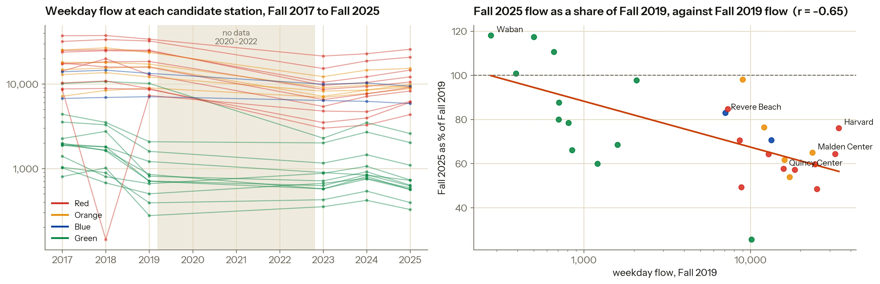
The panel also produced a result I had not gone looking for. The busiest stations recovered worst. Quincy Center, the 2024 answer, sits at 58% of its 2019 weekday flow, while the small Green Line stops in Brookline and Newton are back above 100%. The demand returning to the network is local and spread across the day; the commute into downtown offices has not come back, and a development of homes and shops depends on the first kind.
Building the second version
If the decision is about a parcel, the model should be scoring parcels. The Metropolitan Area Planning Council (MAPC), the regional planning agency for Greater Boston, keeps an inventory of 3,028 redevelopment sites across the region, each with its own land value, buildable area and the station it sits beside. The 2024 model used two of its 64 columns and averaged them up to the town.
A site here is one parcel, and several stations have more than one candidate beside them, so each parcel is named for its station and numbered within it, largest first. Malden Center #1 is the ten acres and Malden Center #3 is the acre and a half two streets over; Harvard has four, #1 to #4. That is what every chart and table below calls them. Each parcel is attached to the nearest station that has a current ridership rating, and anything more than a half-mile walk from one leaves the candidate set.
Eligibility filters the candidates and suitability scores them, and nothing is discarded before the parcels themselves have been looked at.
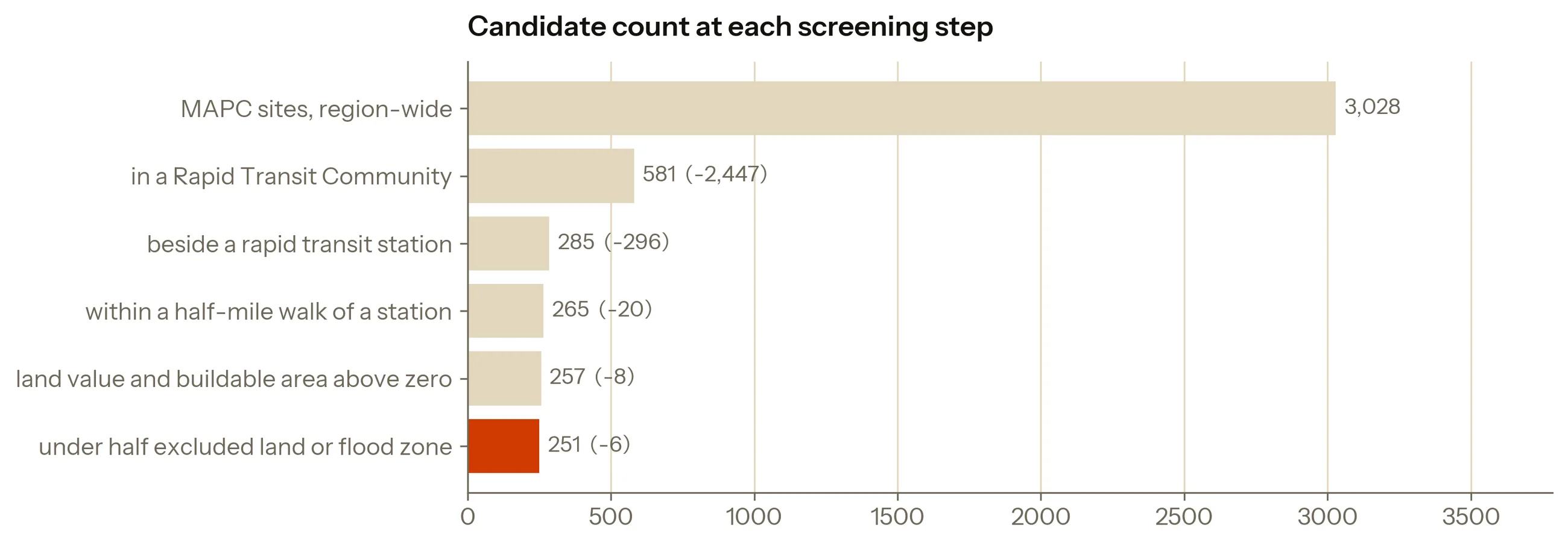
Twelve communities are eligible; nine of them hold a candidate parcel. Half the candidates walk to a Green Line branch.
251
Candidate sites, across nine communities
22
On the shortlist, picked without weights
3
Sites that come first, depending on who asks
A shortlist that needs no weights. Suppose one parcel is cheaper than another, has more room, more riders and steadier demand across the day. Then no set of weights can rank the second parcel above the first, whatever the weights are. A parcel in that position is beaten outright and can go before any judgement is applied at all. Twenty-two of the 251 are never beaten outright. Economists call that set a Pareto frontier; the rest of this page calls it the shortlist. The 2024 model had no step that did this.
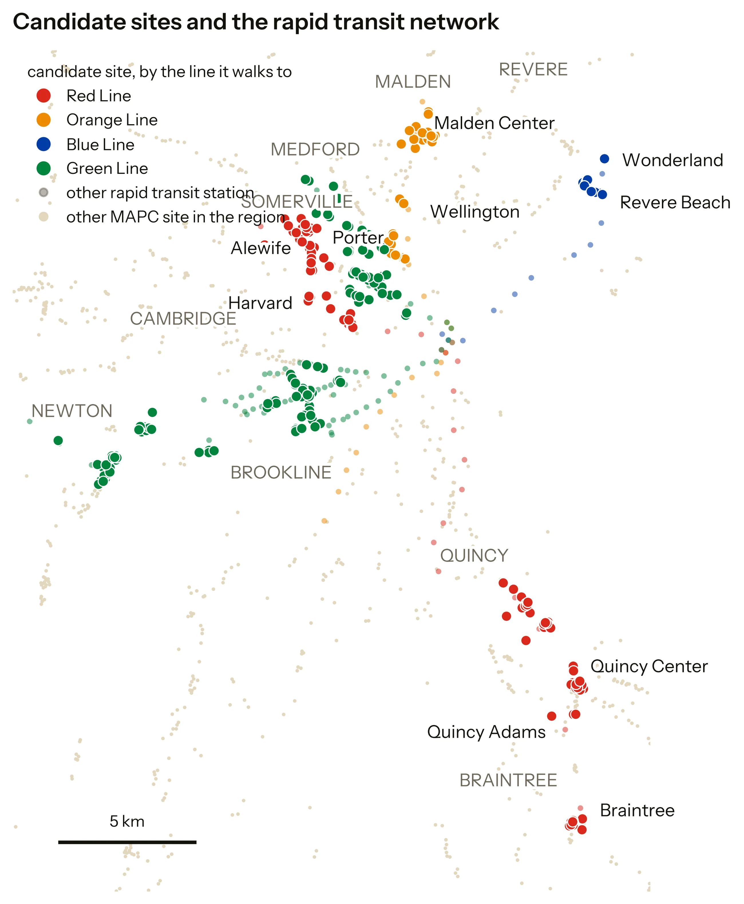
The twenty-two are spread over nine communities and all four lines. The map in the next section places every one of them.
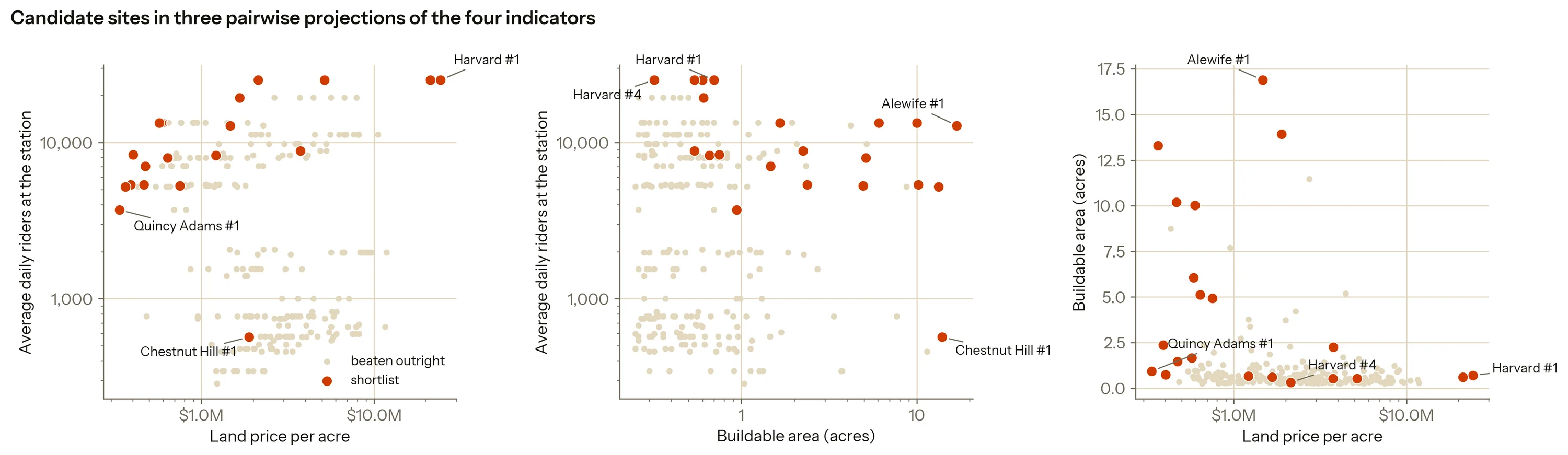
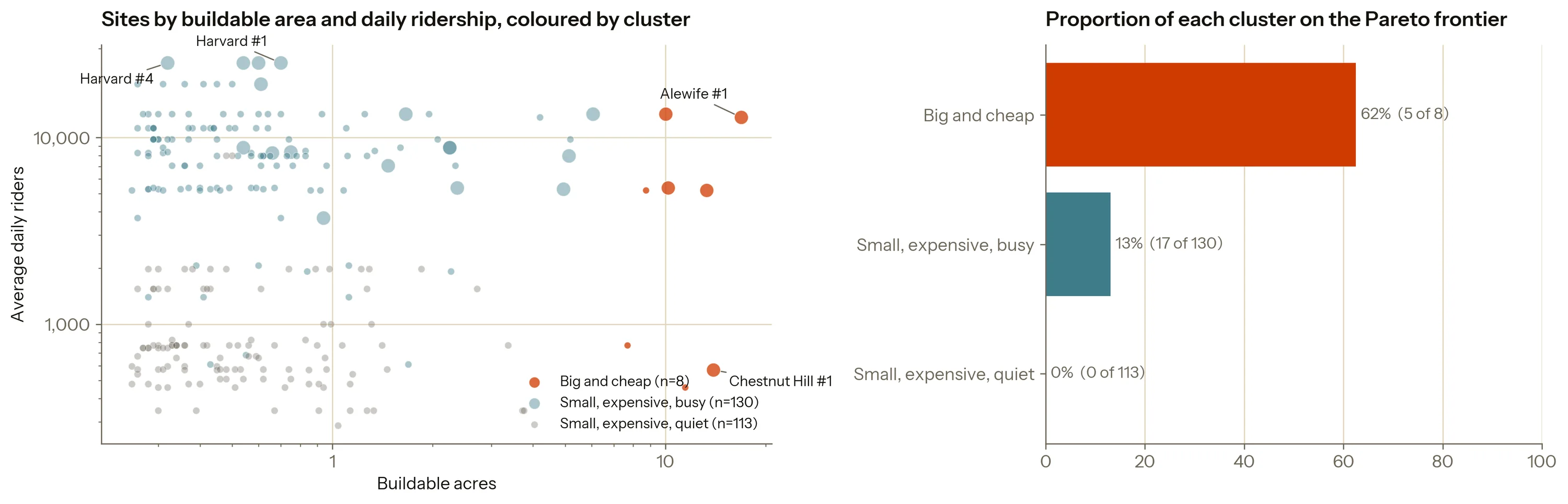
Twenty-two is still too many to read one at a time. Sorting all 251 parcels into groups by how similar their four numbers are gives three kinds of site, and the shortlist is not spread evenly across them. Eight parcels are big and cheap, and five of those eight make the shortlist. A hundred and thirteen are small, expensive and quiet, and none of them do.
That dead forty-five per cent sits mostly on Green Line branches, which have a reputation for being slow. The data can check that reputation directly.
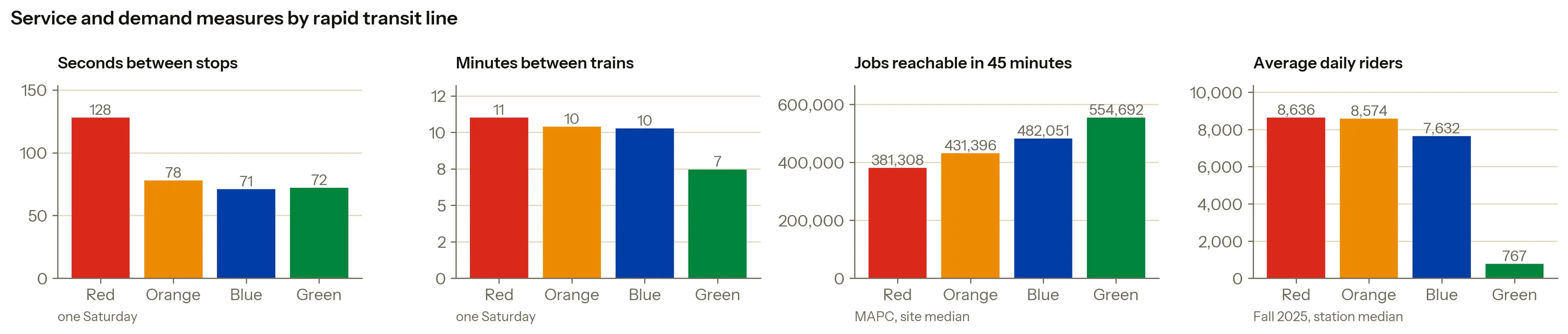
The reputation does not survive the measurement. Green Line branches have the shortest times between stops, the most frequent trains and the best job access in the whole candidate set, on about a tenth of the ridership. A trip along one drags because it stops so often. Whatever holds those sites back, the service they get is fine, and a model built on accessibility alone would have sent me straight to them.
Findings
Weights are a position, so let each position speak. I could not defend one set of weights in 2024 and I still cannot. Choosing more carefully would not settle it, so each scenario below is a stance a real person could hold, written as a set of weights.
| Scenario | What it weights most | Highest-ranked site |
|---|---|---|
| Developer (cost first) | Land price | Braintree #1 |
| City (housing first) | Buildable area | Malden Center #1 |
| Transit agency (ridership first) | Daily ridership | Malden Center #1 |
| Place-making (all-day use first) | How evenly demand spreads across the day | Revere Beach #1 |
| No prior | All four equally | Malden Center #1 |
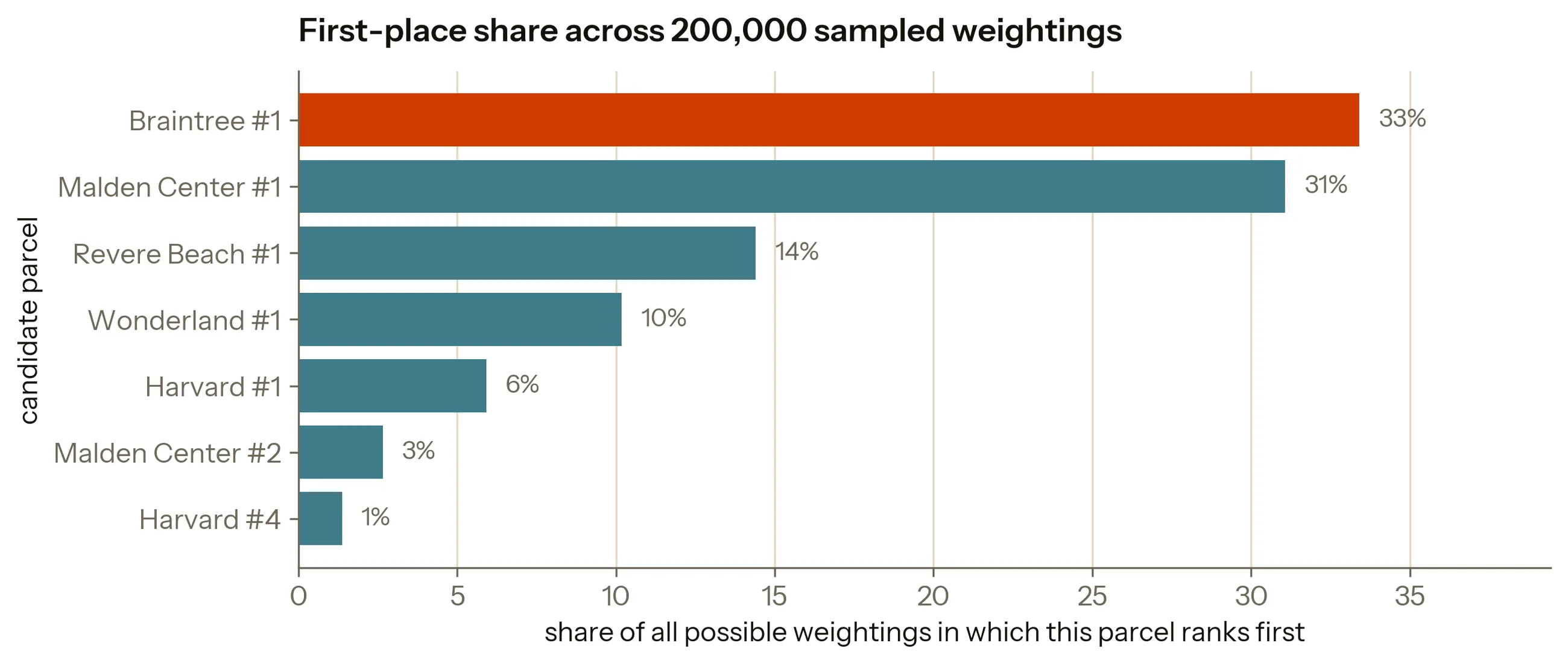
Every row weights the same four indicators and only those, so the table holds five opinions about one set of numbers. Three parcels take first place across them, and all three are on the shortlist, so the no-weights step discarded nothing a weighting would have chosen.
Those three, and the other 248 the model looked at, are on the map below. The markers there are short codes: three letters for the station and the parcel’s number, so MAL-1 is Malden Center #1. Zoom in and the full name replaces the code.
Five positions are five points in a space of every possible weighting, so I drew 200,000 more at random to fill in what lies between them.
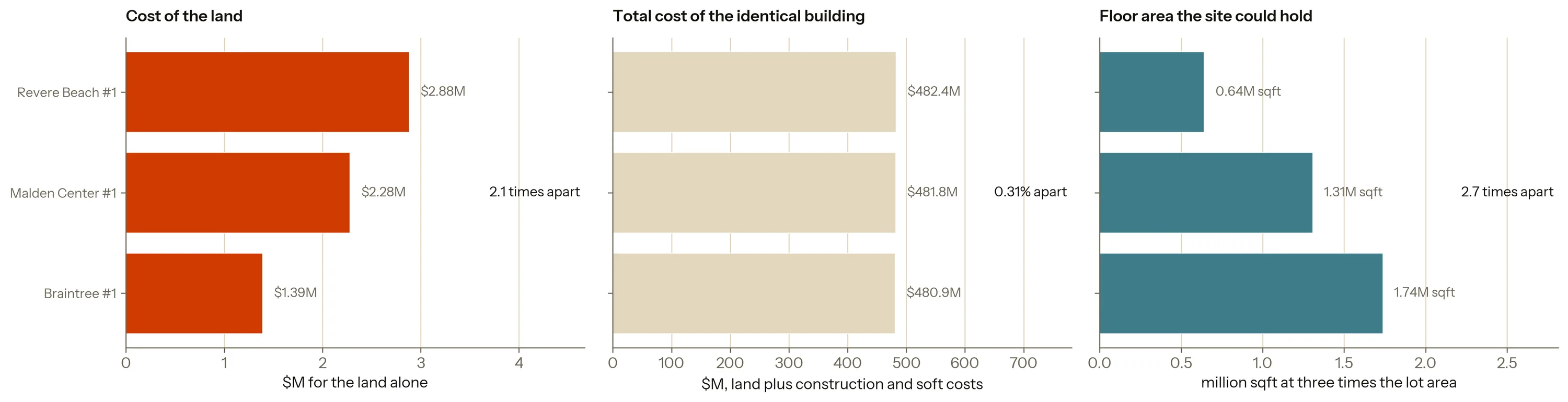
What the choice actually changes. The 2024 model spent its heaviest weight protecting land cost. Running the same cost estimate over each winner settles what that bought.
The finding
Choosing a site barely changes what it costs. It changes how much you get.
The land under the building costs 2.1 times as much at one of the three sites as at another, and the finished building costs 0.31% more. What the sites can hold varies by 2.7 times. The heaviest weight in the 2024 model was guarding the one thing that hardly moves.
Does any of this beat sorting on one column? If the four indicators together rank sites the way any one of them does alone, the model is adding nothing. The check is to sort the 251 parcels each way in turn and see how closely each order matches the order the four produce together, on a scale where 1 is identical and 0 is unrelated. It costs one line per column and I did not run it in 2024.
The accented row at the top is the four indicators combined, and it is the order every other row is measured against, which is why its own cell holds no figure. It is also the last scenario in the table above under a second name: no prior is all four weighted equally, and it picks the same parcel. The four rows under it are those same four indicators sorted one at a time. The last two are not among the four: regional access is the fifth quantity the appendix weighs and sets aside, and MAPC’s site score is a third party’s reading of the same parcels, in the table because it is the one outside opinion available.
| Ranking rule | How closely it matches | Highest-ranked site |
|---|---|---|
| All four, equally weighted | the baseline | Malden Center #1 |
| Evenness of demand across the day | 0.78 | Revere Beach #1 to #7, all tied |
| Daily ridership only | 0.72 | Harvard #1 to #4, all tied |
| Buildable area only | 0.49 | Alewife #1 |
| Land price only | 0.47 | Quincy Adams #1 |
| MAPC's own site score | 0.19 | Porter #1 and East Somerville #1, tied |
| Regional access | −0.05 | Central #2 |
Two of those rules cannot separate parcels at all. Ridership and evenness of demand are measured at the station, so all seven parcels at Revere Beach hold one value and all four at Harvard hold another, and the rule has nothing left to choose between them with. MAPC’s percentile ties Porter #1 and East Somerville #1 at exactly 100. The data imposes that, and it is the same limit the model carries everywhere: a station’s ridership is credited to every parcel beside it.
No single indicator reproduces the four together. Evenness of demand comes closest at 0.78 and still sends you somewhere else. Sorting on ridership alone gives Harvard Square, already the most developed place in the candidate set; sorting on land price alone gives Quincy Adams, a station that is mostly a car park and has the least demand of the group. Those are the two traps the four indicators exist to dodge, and neither is visible from inside a single column.
A second reading, and where it parts from this one. MAPC scores every parcel in its own inventory for redevelopment potential, on criteria that overlap these four without matching them. It carries no more authority than this model does, which is what makes it worth checking against. The two agree on direction: the shortlisted parcels sit at a median 94th place in every hundred across the region, against 83rd for the rest. They disagree about plenty of individual parcels, and the disagreement has a shape.
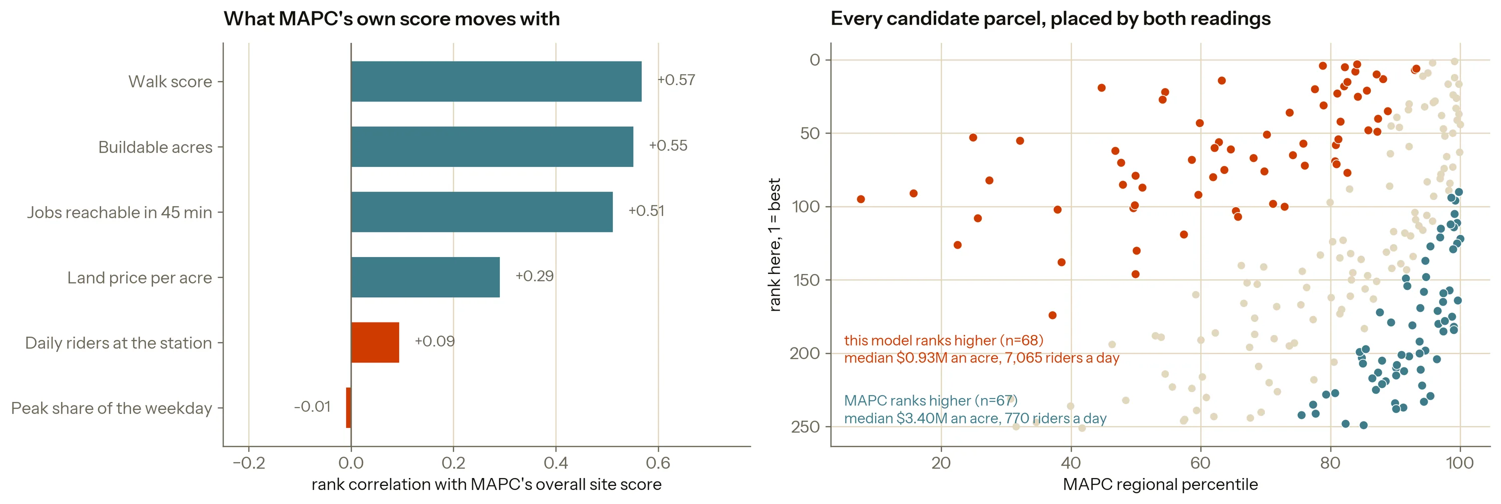
What their score moves with is size and walkability. Ridership barely registers at 0.09 and evenness of demand not at all, so two of the four indicators here are invisible to it. Land price registers at 0.29, and positively: the parcels MAPC rates highest are the walkable, well-connected, expensive ones. The 67 parcels it puts far above this model cost a median $3.40M an acre and carry 770 riders a day, and 29 of them are in Brookline, which holds nothing on the shortlist. The 68 this model puts far above MAPC cost $929K an acre and carry 7,065 riders, and 30 of them are in Quincy. The two readings are answering different questions. Theirs is whether redevelopment would be good for the place; this one is whether a building would pay for itself there.
Where the 2024 answer ended up. The 2024 write-up named the funnel’s weakness and moved on. Checking it against the rebuilt shortlist shows what the weakness cost.
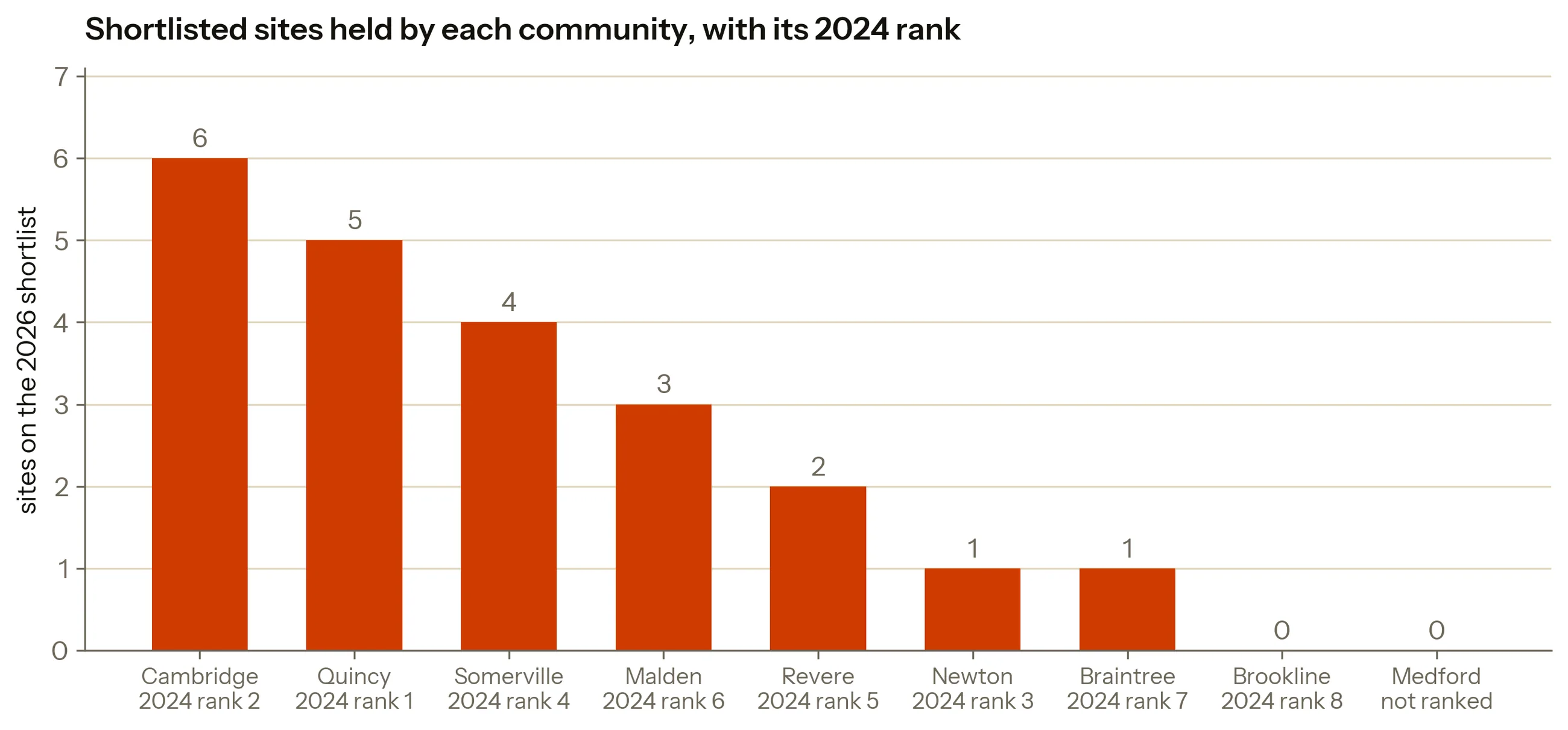
Malden finished sixth of eight in 2024 and holds the site that wins three of the five scenarios here. Brookline finished last of the eight and holds nothing on the shortlist, which is where the two versions agree. Medford was lost in a postcode join and never entered the 2024 model at all. Quincy Center is still on the shortlist and still ranks sixth of 251 under equal weights, so it was a fair answer. It was also a narrow one, from a method that could never have found the alternatives.
How the rebuild is put together
Stations are matched by coordinates. MAPC’s station labels date from its 2022
inventory and some of them have since moved: seven Somerville parcels are filed under
Washington Street, which in the current MBTA feed is a Green Line B stop six
kilometres away in Brighton, and joining on the name handed those parcels Brighton’s
ridership. Every parcel now goes to the nearest station with a Fall 2025 rating, which
disagrees with the MAPC label at 39 of 285 sites, and anything beyond a half-mile walk
leaves the set.
Percentiles against the whole region. The 2024 model rescaled each indicator across its eight communities, which forces the best to 1 and the worst to 0 and ties every score to whoever else happened to be in the frame. Quincy Center’s 82.40 meant best of these four and nothing more, and no other candidate set could be compared against it. Here each indicator becomes a percentile against all 3,028 sites in the regional inventory, so a site’s score holds still when the shortlist changes.
Redundant indicators get dropped. Anything correlating above 0.9 with a sibling is one variable under two names. Weekend ridership goes at 0.98 with daily ridership; estimated mixed-use capacity goes at 0.94 with buildable area. The next highest pair is 0.38, so the cut is not a close call. Four quantities are left, measuring four things.
Why regional access is only a column. It duplicates none of the four and orders the parcels almost independently of them, which is what disqualifies it as a criterion: anything scoring well on a measure that agrees with nothing gets an axis where nothing beats it, and one axis is all dominance needs. Added to the filter the shortlist goes from 22 to 54; weighted as a sixth scenario it returns Malden Center #1, which equal weights already pick.
Hard constraints filter. A site more than half covered by excluded land or by the hundred-year flood zone is removed outright. No amount of cheap land makes a floodplain buildable, so there is nothing to trade off.
The peak window is checked against a known-good one. Fall 2025 reports ridership by hour, so the peak has to be defined by hand. I scored four candidate definitions against the period-based Fall 2024 file and used the one that agrees at 0.96: seven to ten in the morning, four to seven in the evening.
Six seasons changed the vintage and nothing else. Growth is tempting to add and wrong twice over. Percentage recovery is an artefact of the base: Riverside returned to 236% of its 2019 flow while shedding 1,251 riders a day since 2023. And absolute growth correlates 0.87 with ridership itself, which is the redundancy problem again. The panel changed which year the model reads.
Takeaways
Why a model at all. The policy creates a question it does not answer, and the easy way out is to pick somewhere that feels right and reason backwards. Weighting indicators does not remove the judgement. It moves the judgement into a handful of numbers in one place, where someone can argue with a specific one. That was the point in 2024 and it still is.
What I would carry forward. Choose the unit of analysis to match the resolution the decision happens at: scoring towns to choose a parcel hid a 12-fold price spread inside Quincy. Correlate the indicators before weighting them, because two of the eight I started with repeated a sibling above 0.9, and the weight table credited each of them separately. And test a single winner against the weights that produced it. The most any parcel here manages is a third of the possible weightings, which is a good deal less certainty than a ranked list appears to offer.
What it still cannot do. Nothing here describes who lives near these sites, which is the first thing anyone financing housing would underwrite. Land values come from tax assessments, which lag the market. Station ridership is attributed to every parcel beside it, fine for a half-mile catchment and wrong at the corner. And nobody who works in these municipalities has seen a line of it: all five positions in the scenario table are ones I wrote for them.
The difference between the versions
The funnel I flagged as a risk in 2024 had already discarded the site the rebuild keeps returning to.
The 2024 write-up said in its own conclusion that a strong station in a mid-ranked community would never be evaluated. Testing that sentence took one comparison against the rebuilt shortlist, and the comparison came two years after the sentence. What it shows is above: the community the funnel dropped in sixth place holds the parcel that comes first under three of the five scenarios and under a third of all the weightings I could draw.
Credits
- Skills
- Data analysis
- Spatial analysis
- Decision modeling
- Data visualization
- Urban analytics
- Tools
- Python
- pandas
- scikit-learn
- Matplotlib
- Leaflet
- Roles
Analysis and modeling
- Zhuoqi Liu
Faculty guidance
- Nabeel Gillani
- Note
Built on MAPC's Rethinking the Retail Strip Sites inventory (January 2022), MBTA rail ridership for Fall 2017, 2018, 2019, 2023, 2024 and 2025, MBTA subway performance for 3 February 2024, the Commonwealth of Massachusetts MBTA Communities compliance data, and route geometry from the MBTA GTFS feed. The map is drawn with Leaflet over OpenStreetMap tiles. Every data file is in the linked repository.